Double R Rentals
EQUIPMENT RENTAL COMPANY | DELTA, BC
Built over three generations, Double R Rentals tailors equipment rental solutions for a wide range of commercial and residential projects.
Double R Rentals is a local, family-run equipment rental company serving homeowners, contractors, and industrial crews across the Lower Mainland. They offer everything from small tools to heavy equipment and are backed by a team people trust for their honesty, problem-solving, and genuine commitment to getting customers what they need to get the job done.
THE ASK
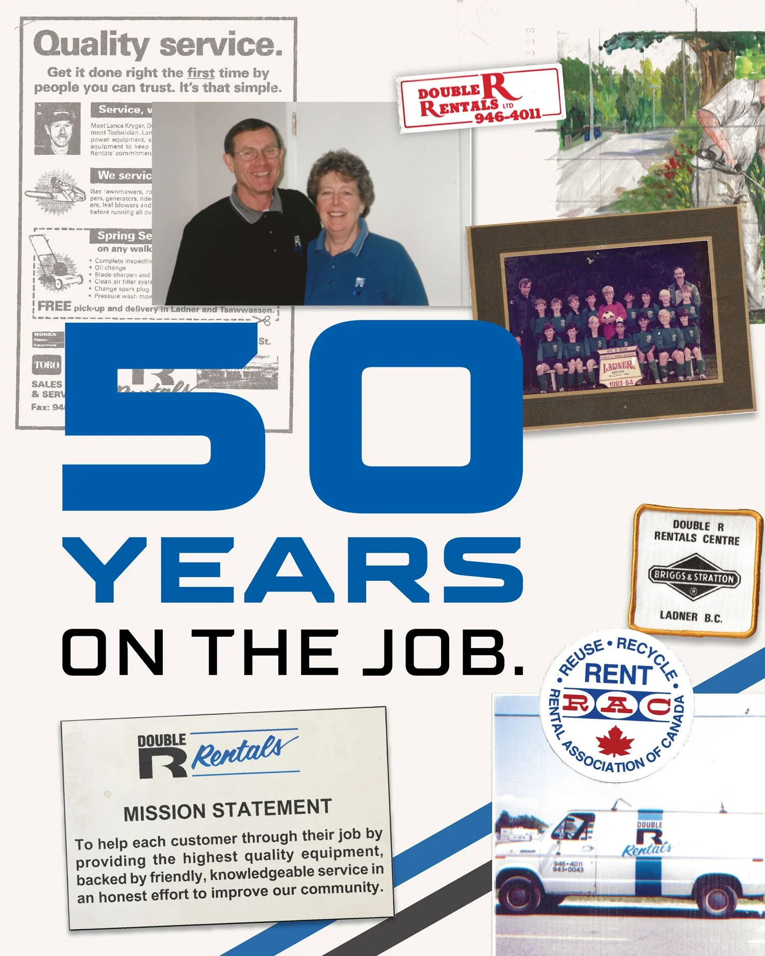
Double R Rentals approached us as they neared a major milestone: 50 years of serving homeowners, contractors, and industrial clients across Delta. After five decades of growth, the brand no longer reflected who they had become: a multi-location, three-generation business known for its reliability, problem-solving expertise, and deep community roots.
They needed a refreshed identity that honoured their heritage while connecting with new audiences and positioning them for the future. Something that would modernize the brand, celebrate the legacy, and build a visual identity that reflects the company as they are today.
Alongside the rebrand, Double R Rentals also asked us to develop a new tagline that captured their story, values, and the scope of their work.
THE WORK
From the beginning, it was clear that Double R Rentals didn’t need a reinvention, they just needed a brand that finally reflected who they had become after 50 years of service. Through a series of collaborative discovery sessions, we dug into the heart of their business: the three generations of family leadership, the nearly zero employee turnover rate that speaks to their culture, and the problem-solving mindset that keeps customers coming back project after project.
As we moved through the discovery process, a clear identity began to emerge. Double R is defined by consistency, trust, and a genuine commitment to the communities they have grown alongside. Their team approaches each project with grounded expertise, and that practical wisdom became the lens through which we shaped the refreshed brand.
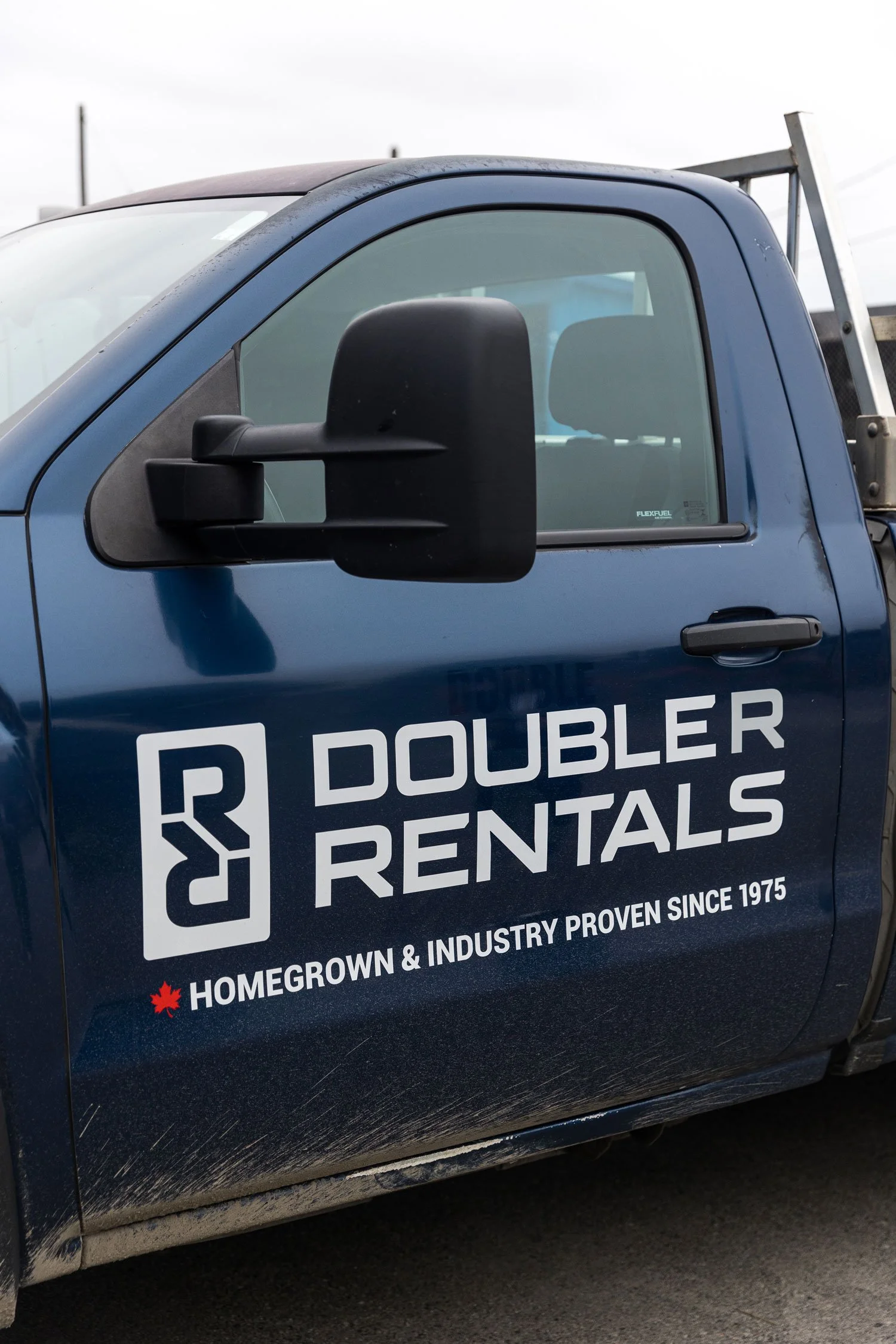
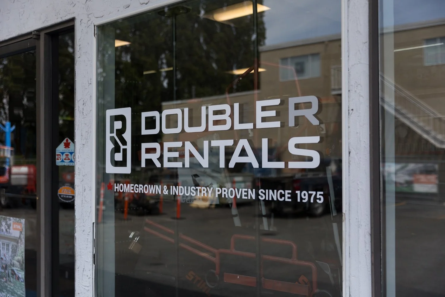
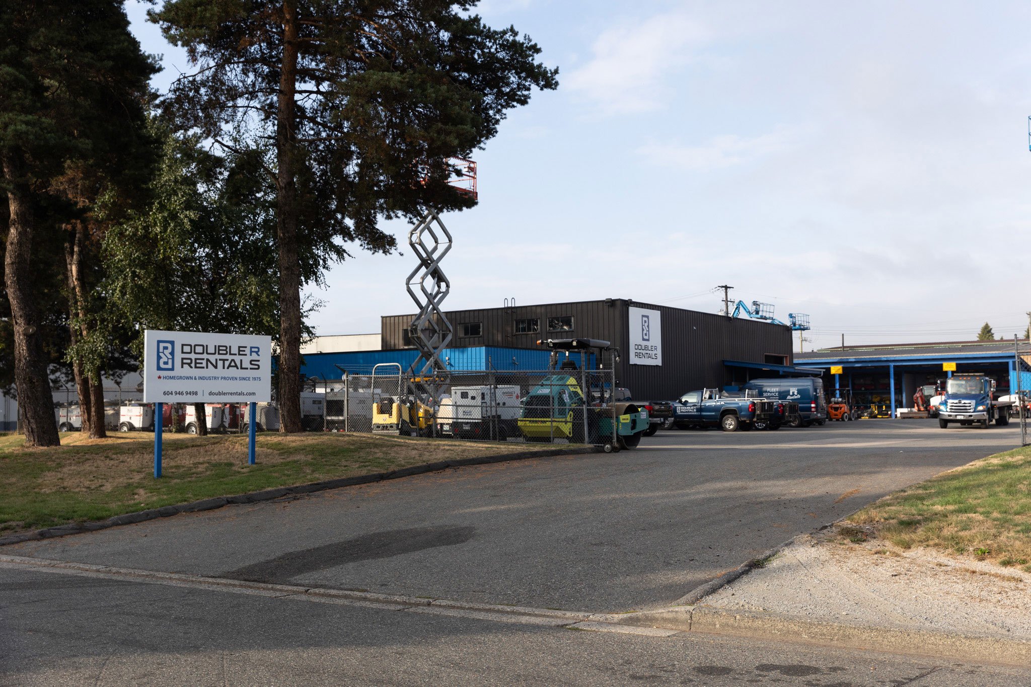
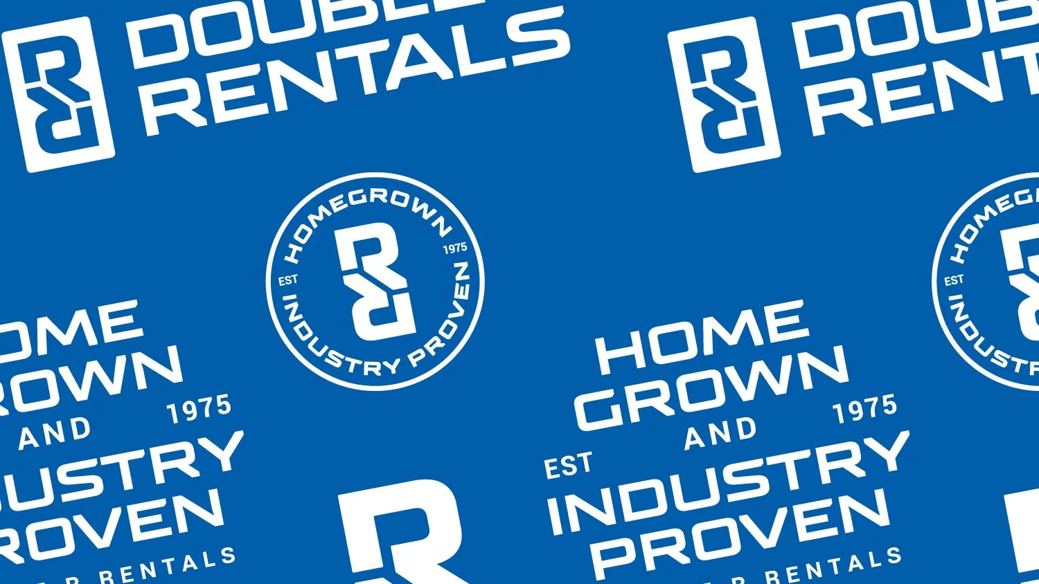
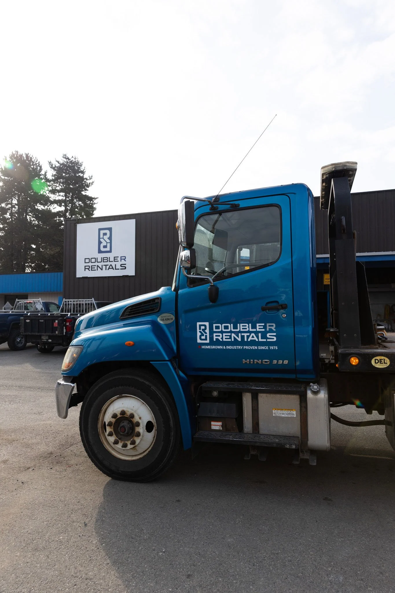
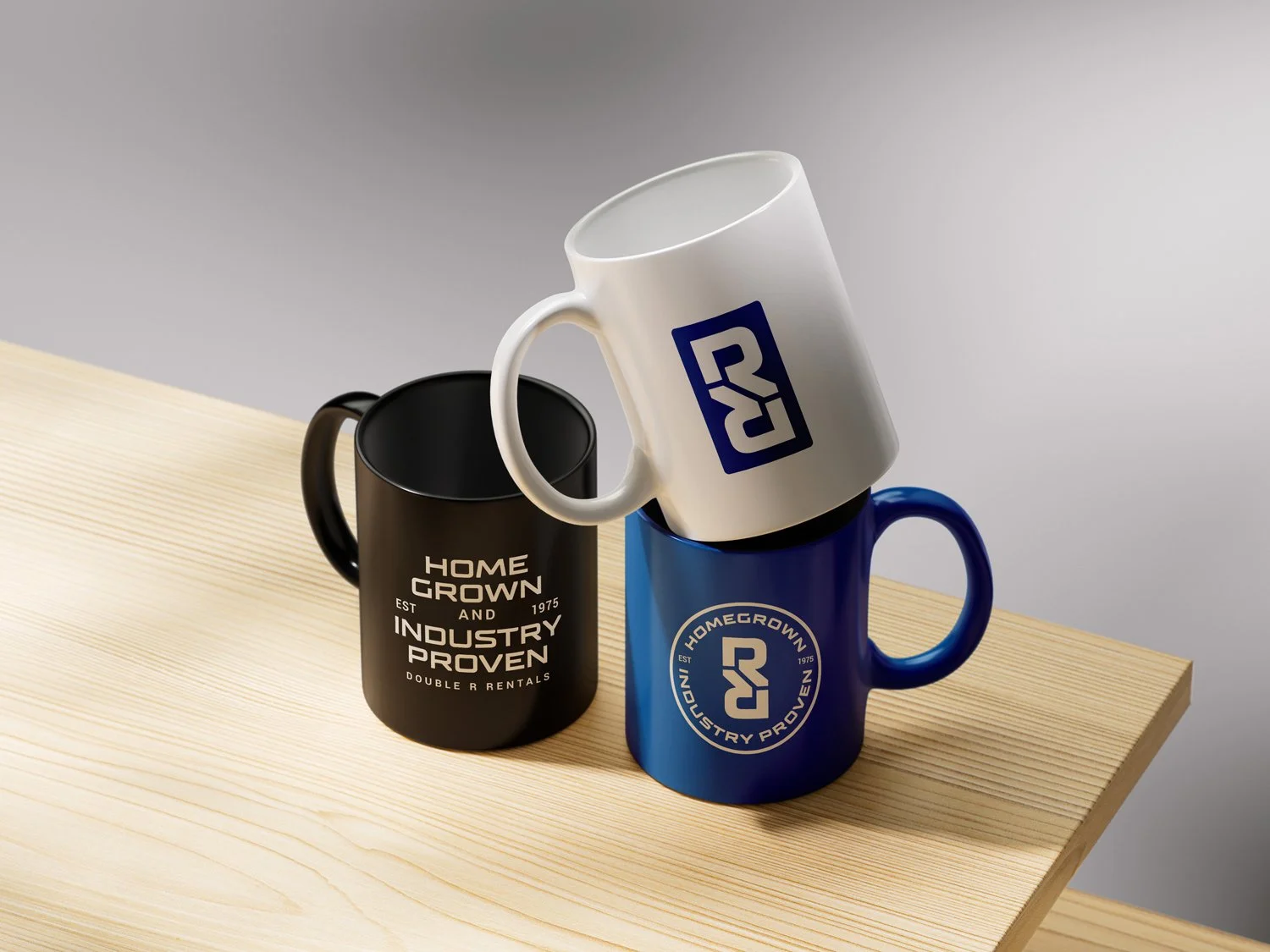
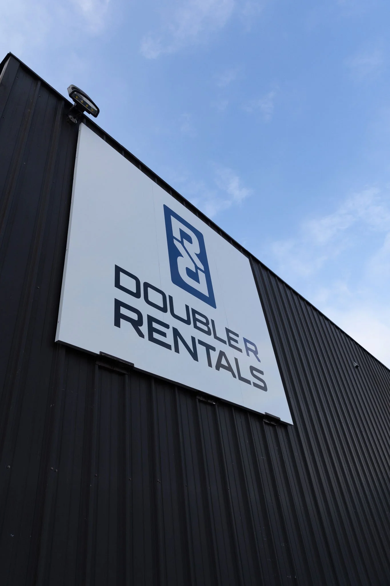
Our role was to bring that story forward in a way that felt modern, confident, and unmistakably theirs. Working closely with the leadership team, we explored how their values could guide every creative choice, from messaging to visuals. The updated logo, formed from two reflected R’s, symbolize structure, dynamic movement, and their dual focus on residential and industrial clients. It introduces a bolder, more contemporary presence while honouring the heritage of the original mark.
We also developed a tagline that could capture both their legacy and their credibility. “Homegrown & Industry Proven since 1975.” celebrates the pride of a family-built business while signalling the experience that has earned trust across homeowners, contractors, and commercial teams alike.
To ensure this identity thrives long-term, we paired it with strategic recommendations for digital updates, signage, audience-based messaging, and future marketing opportunities, providing the tools to keep the brand as consistent as the team behind it.
Together, these elements create more than a refreshed look. They give Double R Rentals a clear, unified way to show up in every interaction. The new identity honours their past, amplifies their strengths today, and positions the brand to confidently tackle the projects of tomorrow.
OUR SERVICES
Discovery sessions and report
Brand identity development
Logo design
Typography
Colour palette
Brand copywriting
Event signage and collateral
Vehicle graphics
Storefront signage
Social media strategy