
Brand Standards Guide
PART ONE
Defining The Brand
Our Brand Name
“Indalma”
GREEK WORD FOR “VISION”
At Indalma, we don’t do mediocre. We pay attention to the details and go all out to make sure our clients have what they need to succeed. Some people may call it obsessive, we can live with that. We have a vision and our good work makes us proud and gets results. Otherwise, what’s the point.
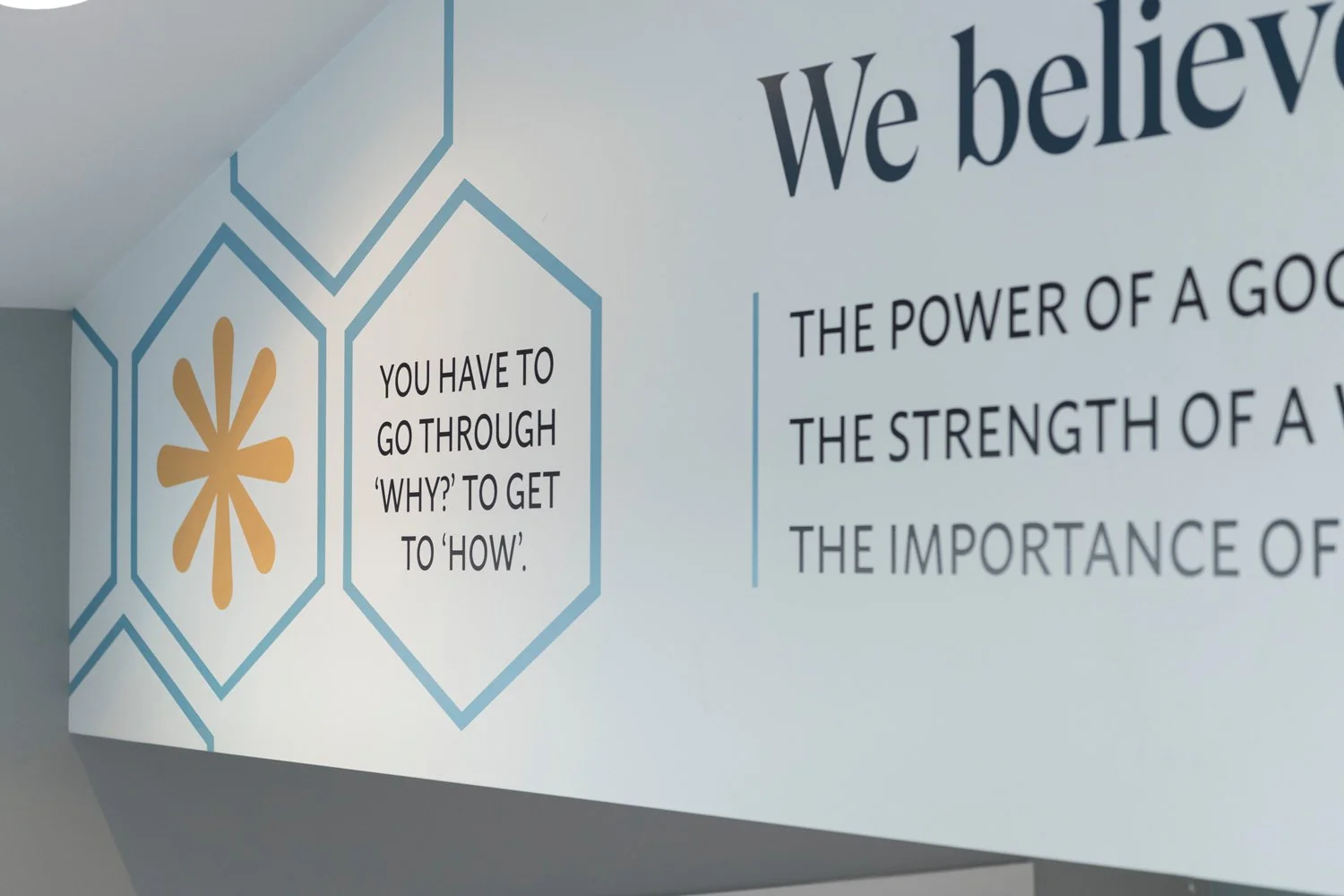
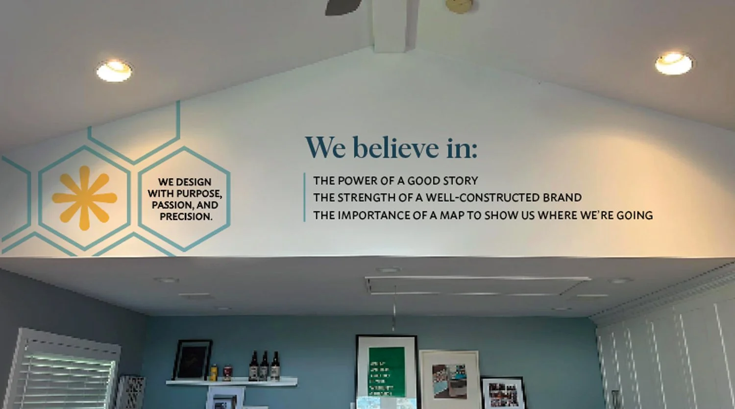
We Believe In…

Our Voice
friendly & formal
We Are
We Are Not
Our USPs
We learn how your world works.
Before we shape how your brand looks, we take the time to understand the people, pressures, and realities behind it.
We are leaders in police branding in Canada.
We've partnered with police agencies across Canada on recruitment campaigns, fleet graphics, signage systems, public engagement, and identity design. It's a niche we know deeply.
We bring senior-level thinking to every project.
All of our projects benefit from experienced guidance, clear rationale, and strategic thinking that stays connected to the work.
We carry brands into the real world.
From environmental graphics to signage and wayfinding, we think beyond the brand guide and into the spaces people actually experience.
We know how to move complex projects forward.
Twenty years of experience has taught us how to navigate stakeholder input, competing priorities, and the realities that shape brand work in practice.
Our Audiences
-
Our clients come to us across industries: from retailers, brewers, and construction companies to foundations, police departments, independent schools, and non-profit organizations. We’re proud to work with them all.
Some come to us for specialized expertise, particularly in branding for police agencies, independent schools, or craft breweries. But most of the time,they come to us for our approach: the deep solutions, pragmatic strategy, and an uncompromising commitment to excellence.
-
Like our current clients, these are people who come to us across industries. Unlike our current clients, these are people who are not already familiar with what Indalma does and how it operates.
They want clarity and confidence. What we specialize in, what we do exceptionally well, the kinds of projects we enjoy, and what it’s actually like to work with us. Most importantly, they’re looking for proof: evidence that builds trust before the first conversation even begins.
-
Our network is made up of fellow designers and collaborators.
They engage with our brand to find inspiration and opportunities for collaboration that will inform and elevate their own work.
-
Storytellers, strategists, problem solvers, relationship builders, project managers, marketers, copywriters, ux experts, designers, and, above all, team players.
They’re looking to understand who we are beyond the work: how we think, collaborate, and what we value. This helps them to assess alignment, creatively, professionally, and personally before stepping into our world.
PART two
Design Elements
Our Logo
The logo is the most instantly recognizeable symbol of a brand
It’s more than a mark. It’s the foundation of our visual identity, setting the tone for every story we tell and every experience we design.
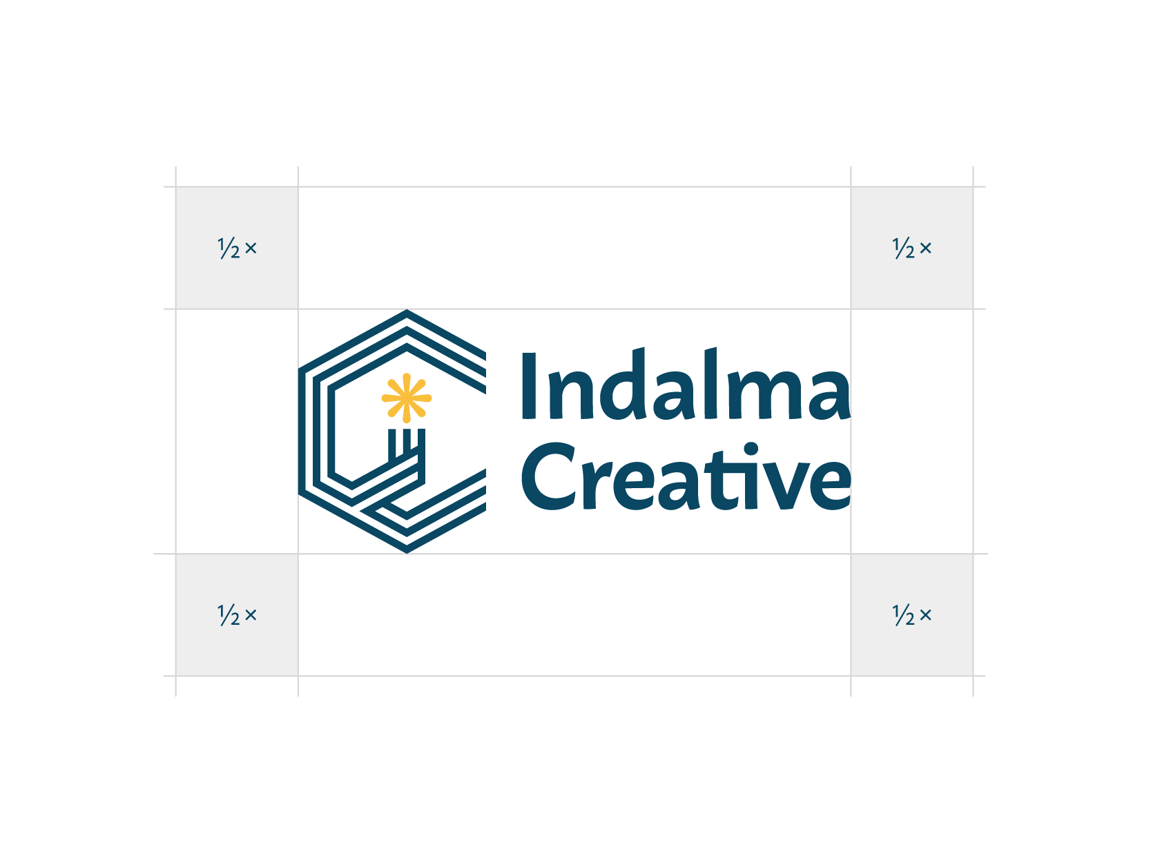
Primary Logo
The Indalma Creative logo is inspired by the idea of a guiding light or vision. Like a lighthouse, it represents how Indalma provides guidance and purposeful direction for the brands, businesses, and organizations we partner with. Rooted in the meaning of our name, the mark reflects our belief that strategic design should not just look good, it should help lead change.
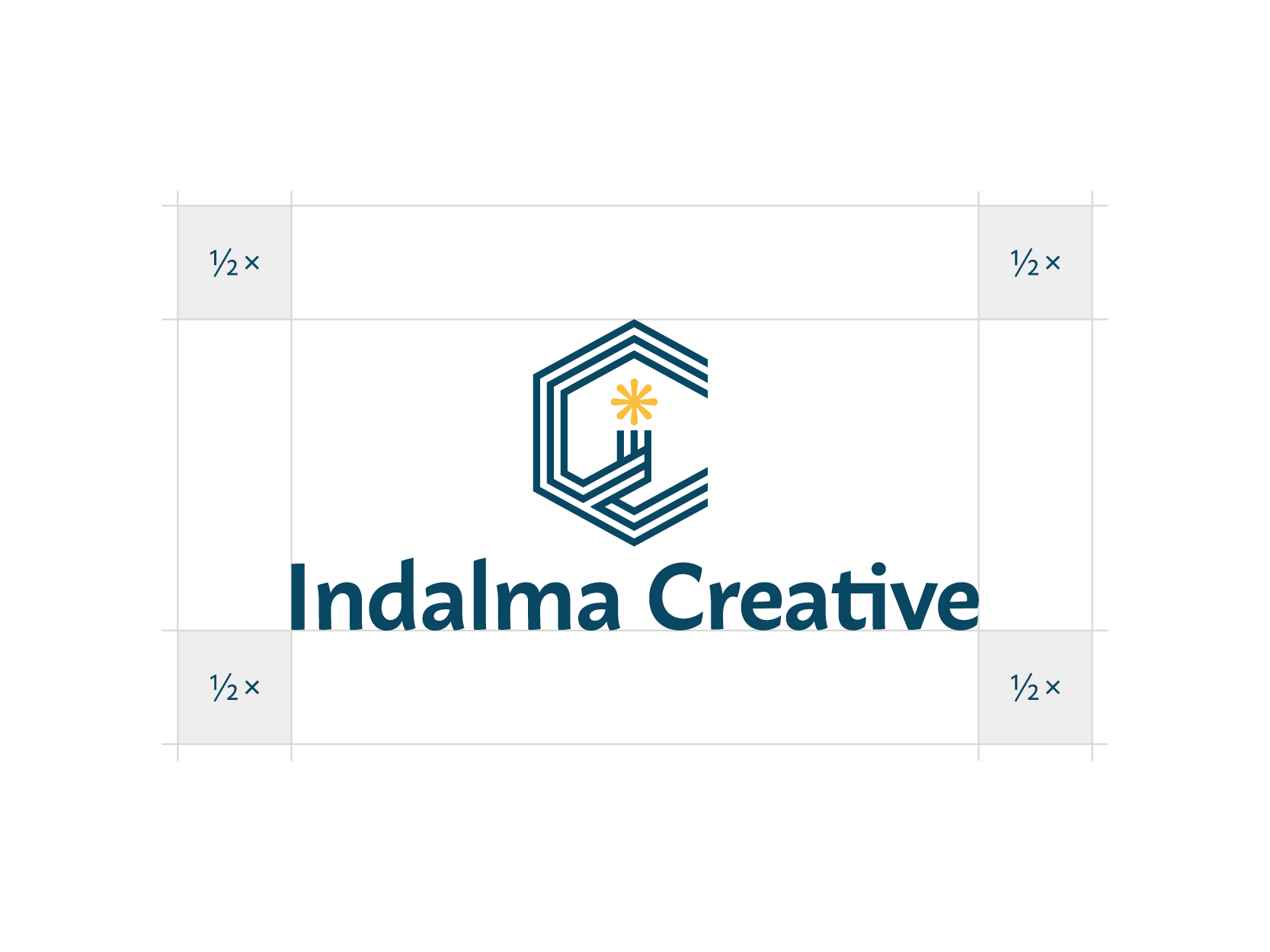
Secondary Logo
The secondary logo is used in situations where the primary logomark becomes too detailed or loses legibility at smaller sizes or in constrained spaces. It provides a simplified, recognizable alternative while maintaining the integrity of the brand.
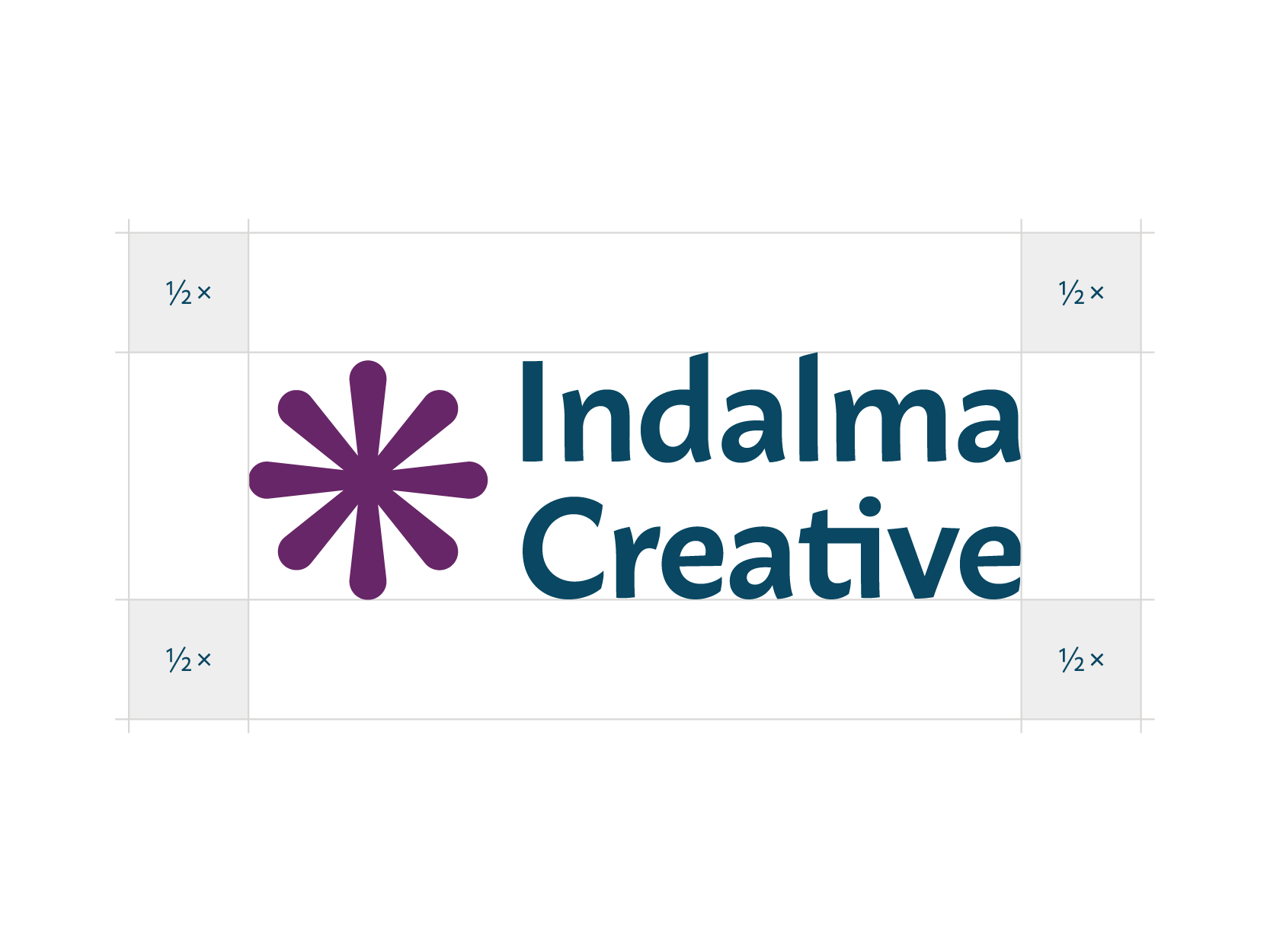
Tertiary Logo
The tertiary logo should only be used in special cases when the logo is needed at a very small size where neither the primary or secondary logo are suitable.

Logo With Taglines
Logo lockups with taglines are used to provide additional context and help Indalma speak to different audiences. The tagline referencing organizations allows us to connect with partners who may not identify as traditional businesses, like police agencies or private schools, while the businesses tagline speaks more directly to our core commercial clients.
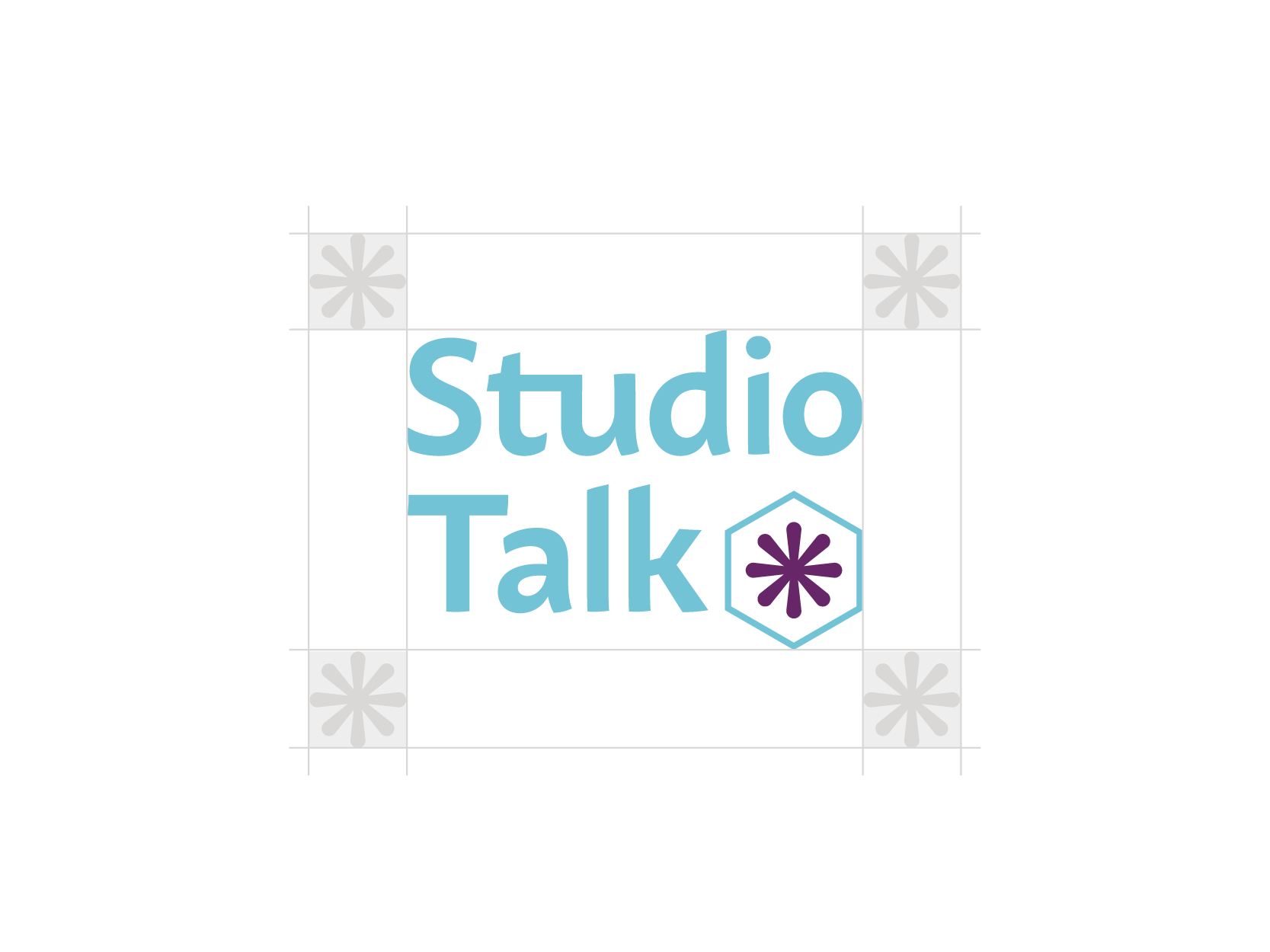
Studiotalk Logo
This logo is for Studiotalk only. It should be used across Studiotalk communications such as the Studiotalk web page and newsletter. It should never be used to represent the Indalma brand as it is intended for Studiotalk communications only.
Primary Logo
The Indalma Creative logo is inspired by the idea of a guiding light or vision. Like a lighthouse, it represents how Indalma provides guidance and purposeful direction for the brands, businesses, and organizations we partner with. Rooted in the meaning of our name, the mark reflects our belief that strategic design should not just look good, it should help lead change.
Secondary Logo
The secondary logo is used in situations where the primary logomark becomes too detailed or loses legibility at smaller sizes or in constrained spaces. It provides a simplified, recognizable alternative while maintaining the integrity of the brand.
Tertiary Logo
The tertiary logo should only be used in special cases when the logo is needed at a very small size where neither the primary or secondary logo are suitable.
Logo With Taglines
Logo lockups with taglines are used to provide additional context and help Indalma speak to different audiences. The tagline referencing organizations allows us to connect with partners who may not identify as traditional businesses, like police agencies or private schools, while the businesses tagline speaks more directly to our core commercial clients.
Studiotalk Logo
This logo is for Studiotalk only. It should be used across Studiotalk communications such as the Studiotalk web page and newsletter. It should never be used to represent the Indalma brand as it is intended for Studiotalk communications only.

When to use each logo
-
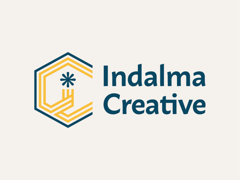
The full-colour logo is the preferred option and should be used whenever possible. It should appear on light or neutral backgrounds where contrast and legibility are clear.
-
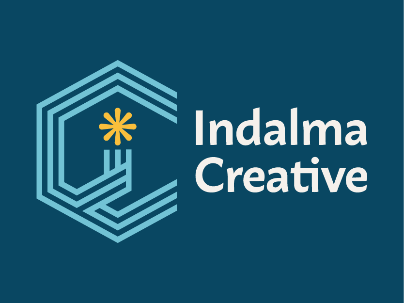
On black or dark backgrounds, use the reversed (light) version of the logo to ensure strong contrast and legibility. The logo should never appear dark-on-dark or lose definition against the background. Maintaining visibility and integrity always takes priority over stylistic preference.
-
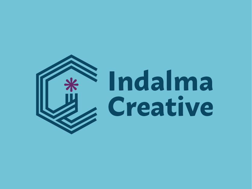
When colour reproduction is limited or unnecessary, the logo may be used in a single colour, either cream or navy. Single-colour applications should prioritize visual clarity and contrast.
Logo Faux Pas
Do not crop the logo
Do not change spacing
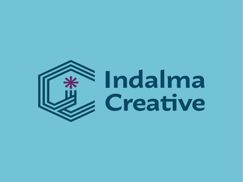
Do not distort the logo
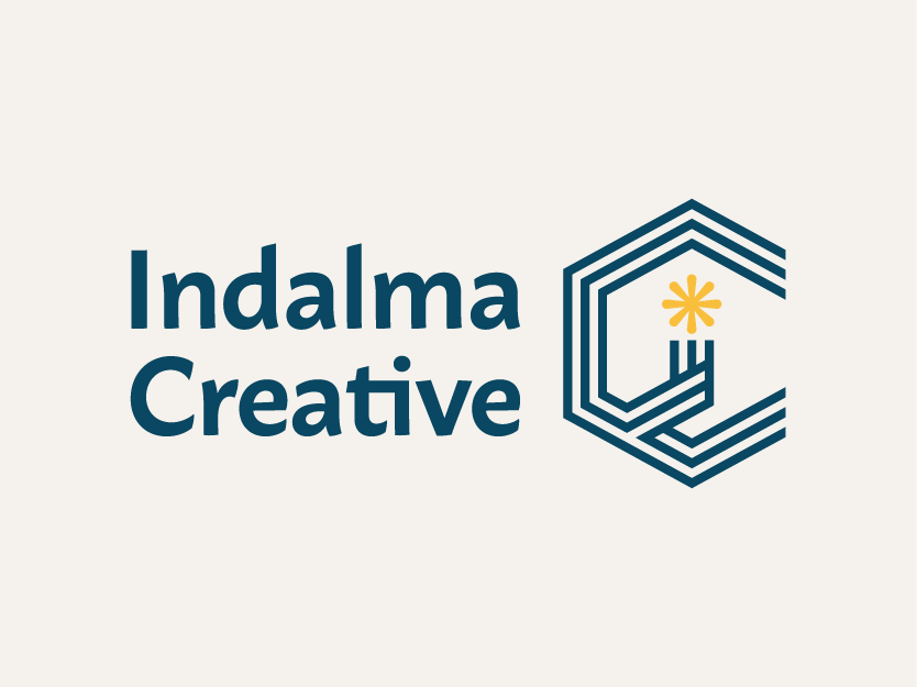
Do not switch order
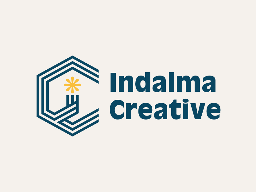
Do not use another typeface
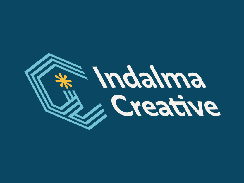
Do not tilt, skew, or shear
Do not alter the colours
Do not change sizing
Do not make your own logo
Brand Elements
Bringing the brand to life beyond the logo
Brand elements extend Indalma Creative’s energy and character without relying on the logo in every instance.
It’s important to note:
The yellow light/star icon (seen left) should never be used on its own, as it can be misinterpreted as it closely resembles an established global brand mark.

Brand Fonts
Typography
Albra Semibold
Albra is a high-contrast serif typeface and, due to the high contrast and warm curves paired with sharp bracketed serifs it works perfect for headline purposes, which is why Albra Semibold is the font used for headlines on most of Indalma branded materials.
A B C D E F G H I J K L M N O P Q R S T U V W X Y Z a b c d e f g h i j k l m n o p q r s t u v w x y z
1 2 3 4 5 6 7 8 9
Macho
Macho is a versatile sans-serif typeface with many, many weights. In the Indalma brand, macho is used for most subheading and always for body copy.
A B C D E F G H I J K L M N O P Q R S T U V W X Y Z a b c d e f g h i j k l m n o p q r s t u v w x y z
1 2 3 4 5 6 7 8 9
Typeface scale
Albra / Semibold
Heading 1
Albra / Semibold
Heading 2
Macho / Semibold/
All Caps
Heading 3
Heading 4
Macho / Semibold
Macho / Regular
Body Copy
Brand Colours
pantone 4160 C
#F9F9ED
CMYK: 96 68 40 25
RGB: 11 73 101
pantone 260c
#493F1E
CMYK: 65 100 25 11
RGB: 111 37 109
PANTONE 630C
#E9EEDA
CMYK: 51 11 15 0
RGB: 123 187 206
charcoal
#493F1E
CMYK: 0 0 0 95
RGB: 51 49 50
PANTONE 136C
#C5CDBD
CMYK: 2 26 86 0
RGB: 248 190 64
cream
#7B6E42
CMYK: 2 3 5 0
RGB: 246 242 237
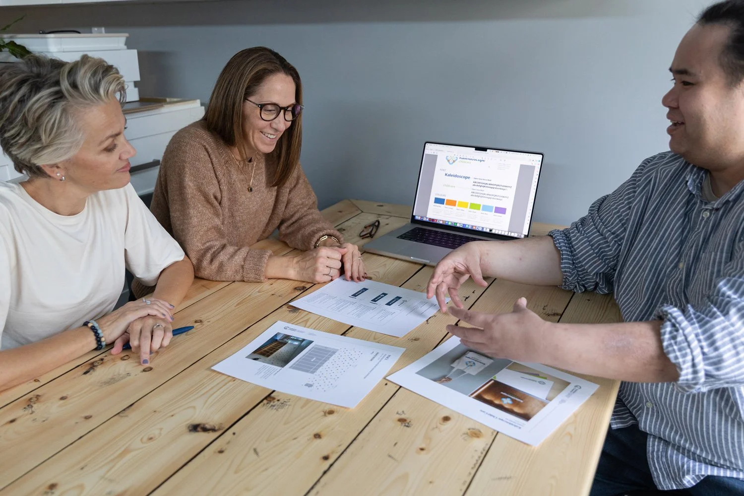
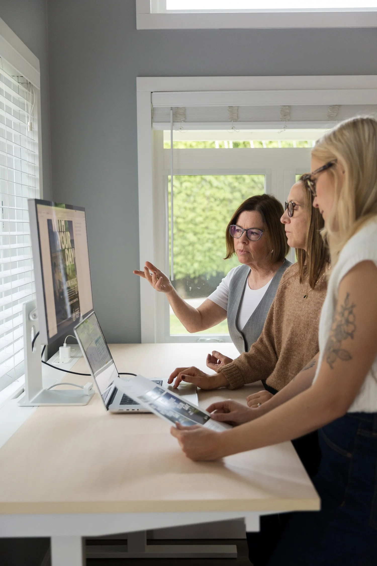
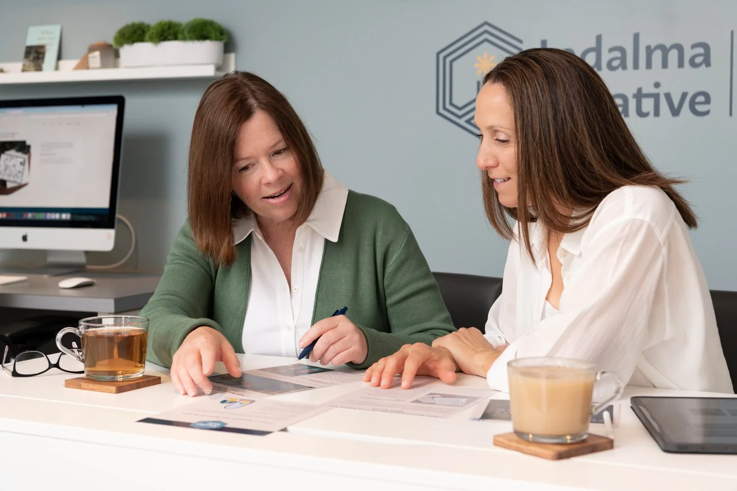
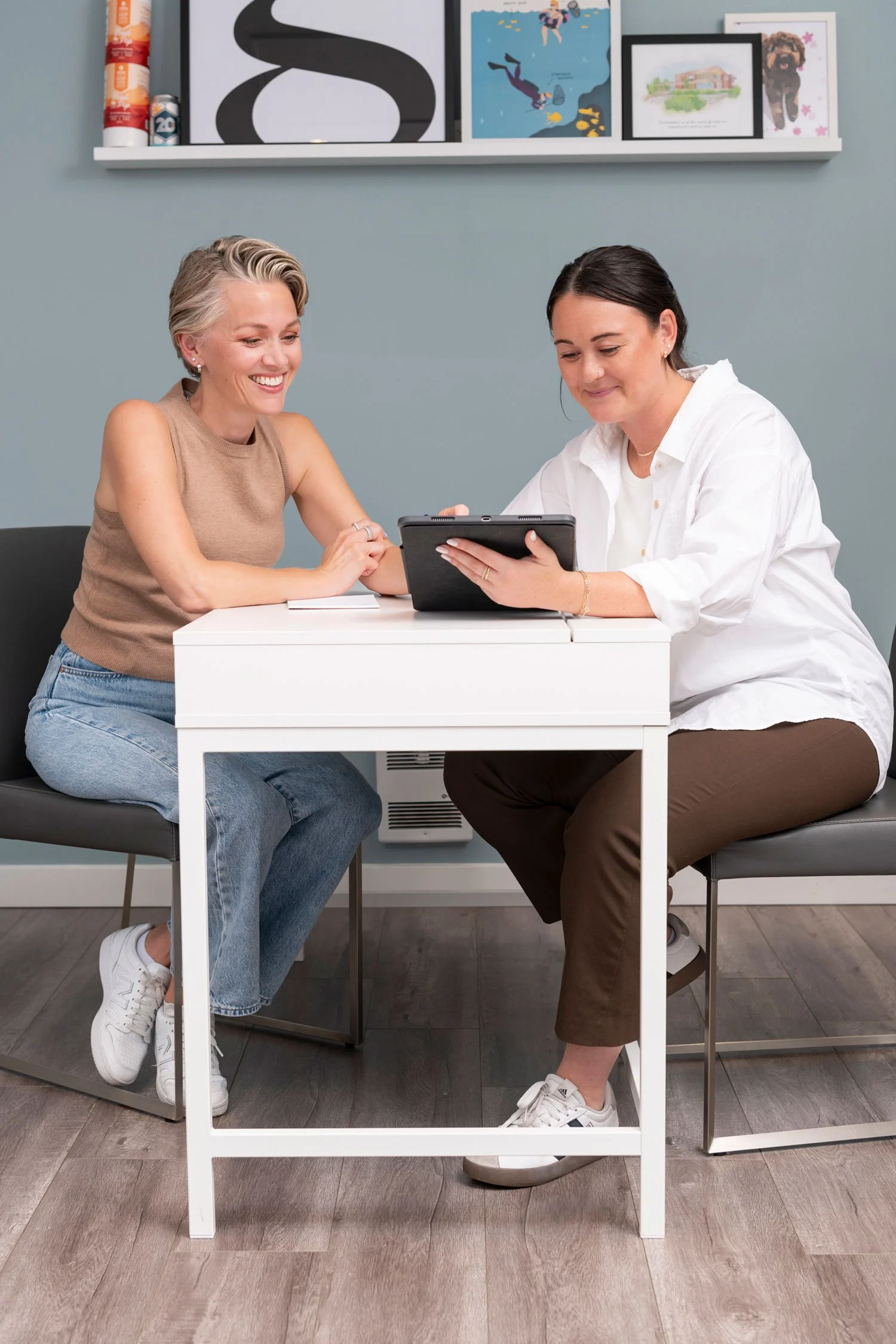
Photography
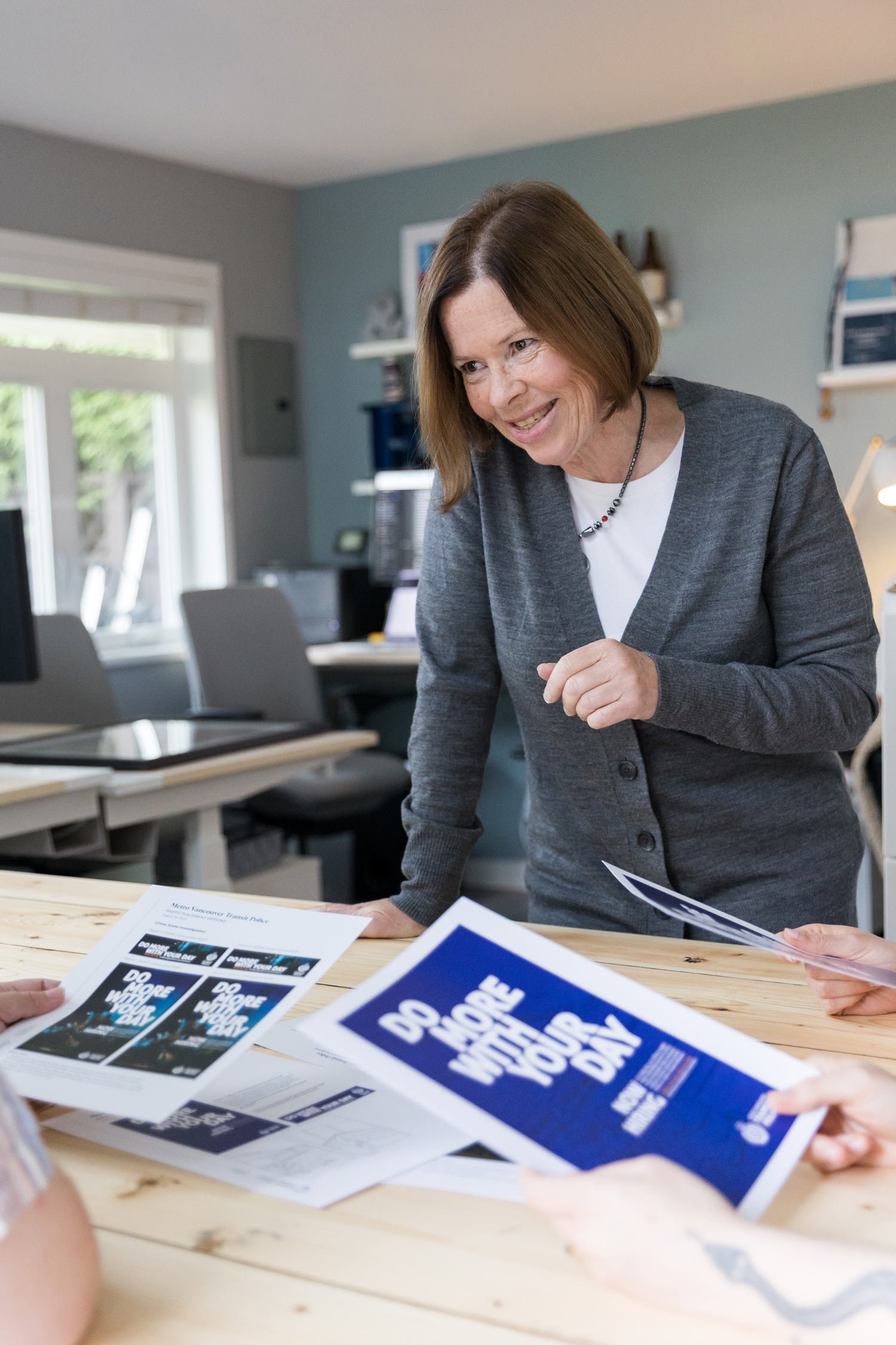
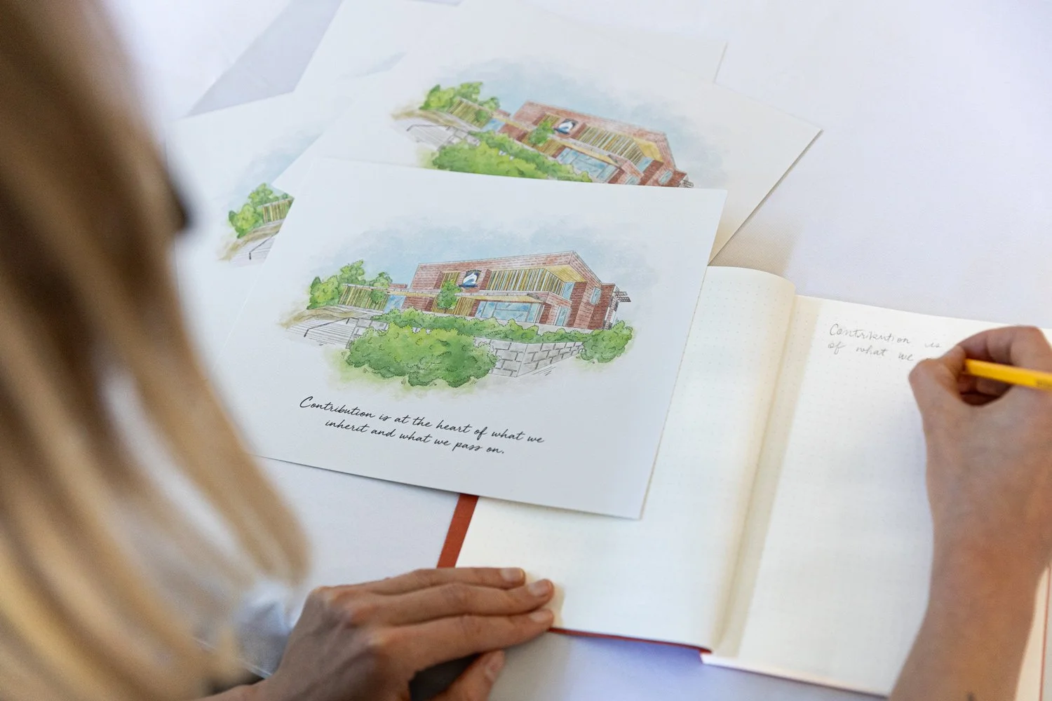
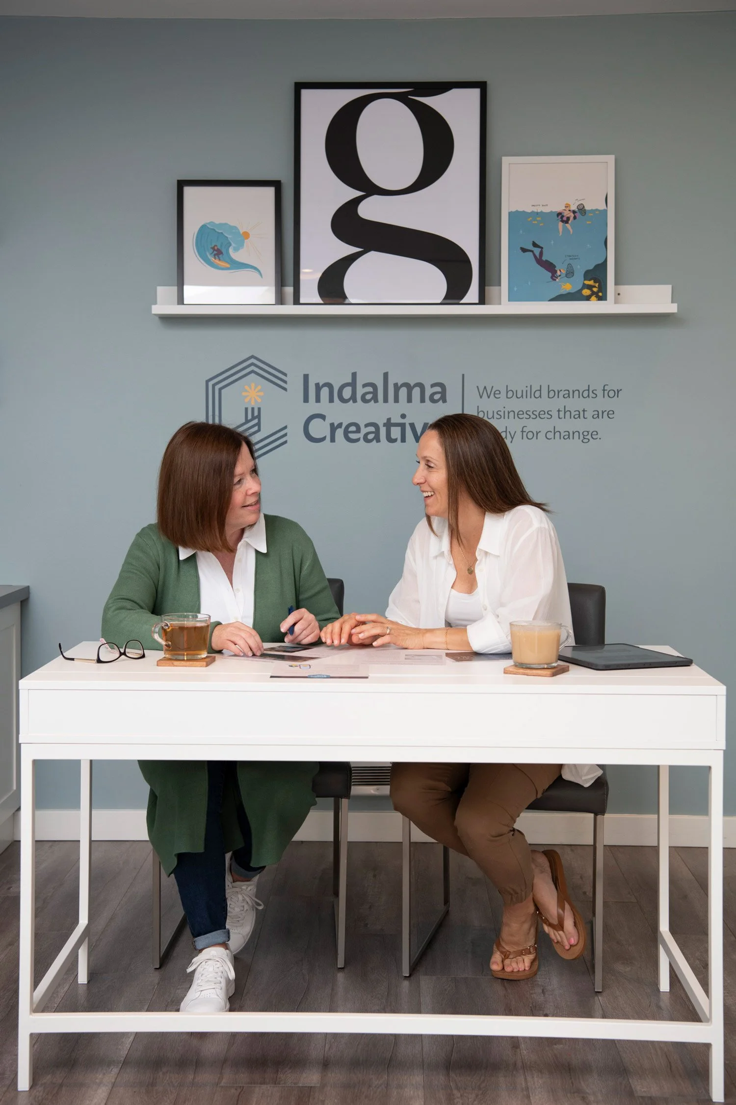
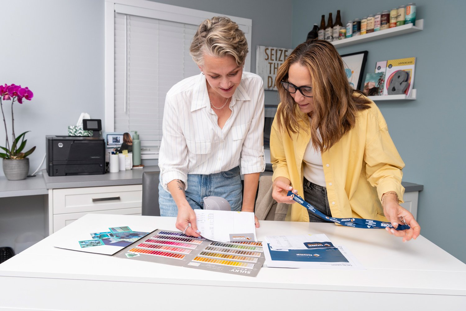
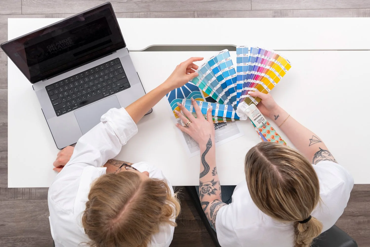
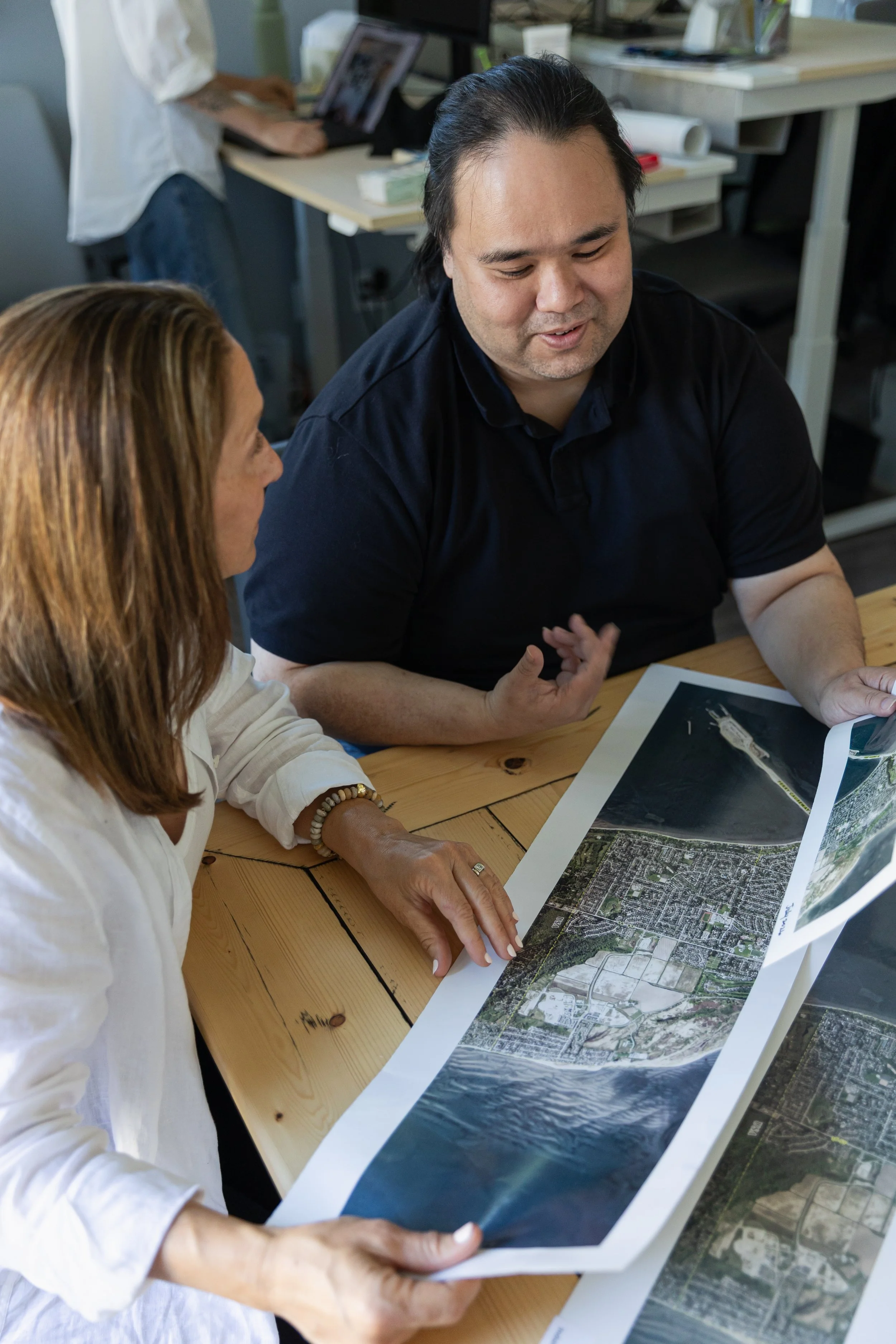
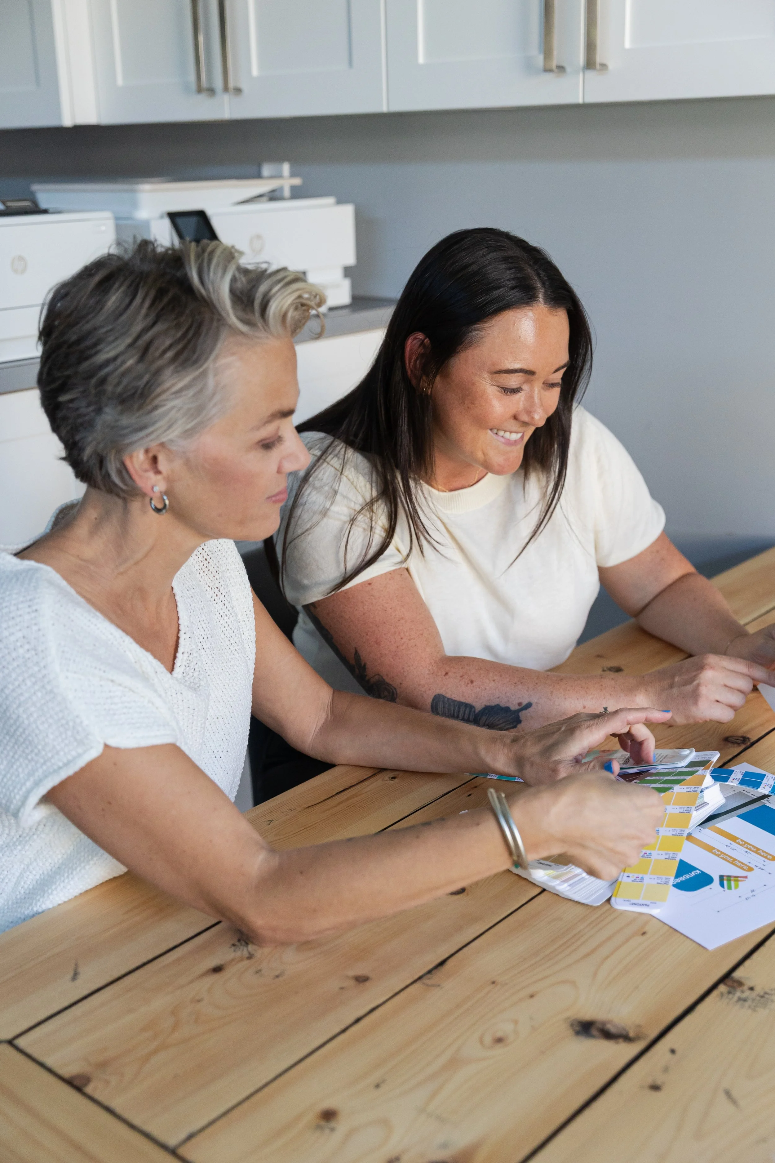
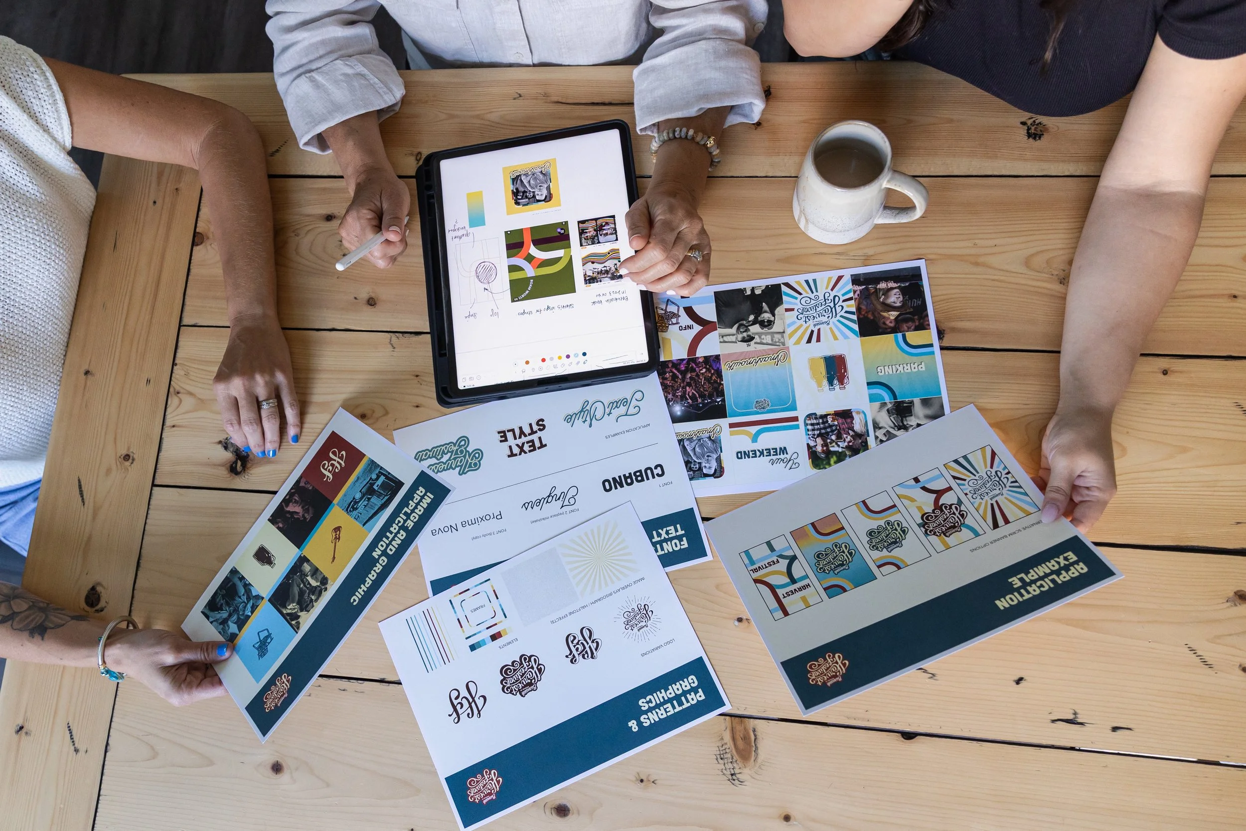
Indalma photography is always light and airy with colours and tones that compliment our brand.
The focus of the images should be on our work and collaboration, and should reflect our friendly, approachable, modern studio.

Illustration
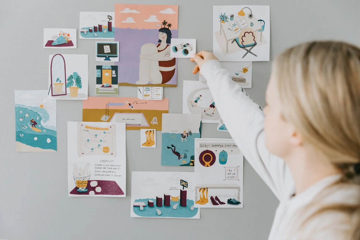
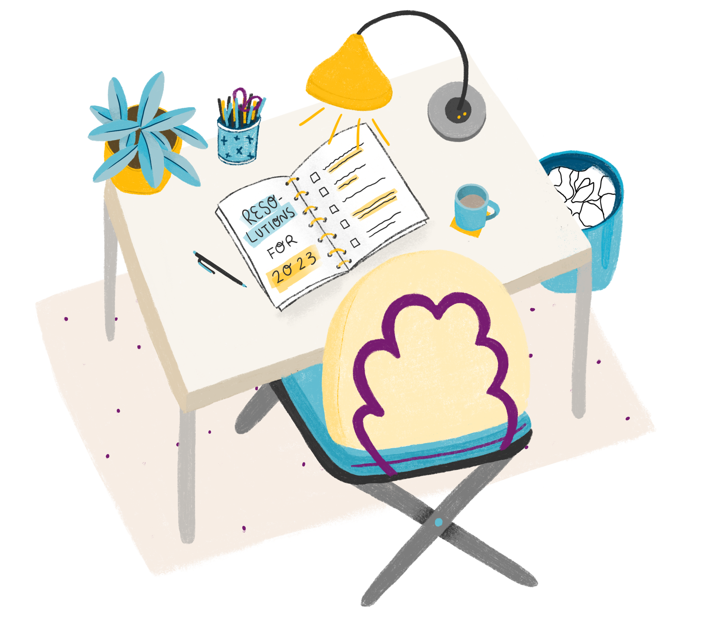
The Indalma illustration style is playful, but professional. Using Procreate, the illustrations are digital pencil drawings. The style relies on two Procreate brushes: the 6B pencil for filling in and thicker lines, the HB pencil for thinner lines and details, and the occasional technical pen for straighter lines and smaller details.





PART three
Applications
Design Application
Applying a brand congruently across all its assets is important
Designing with the Indalma brand doesn’t start and end with just adding a logo on a design and calling it a day. When we apply the brand elements in harmony across multiple applications, we allow the brand, and us by extension, to shine.
Stationery
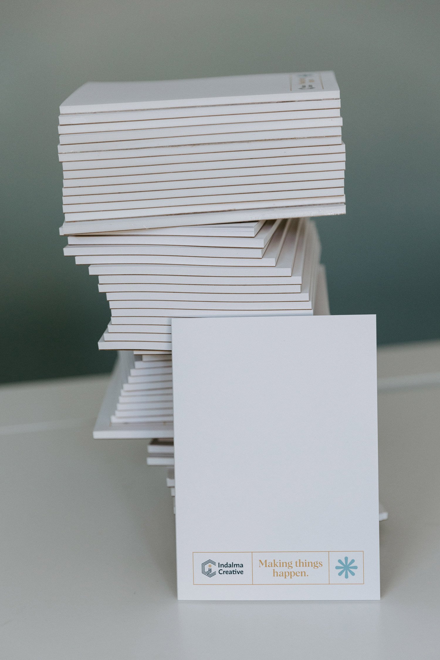
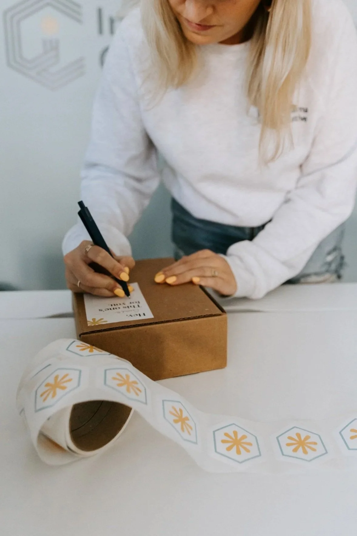
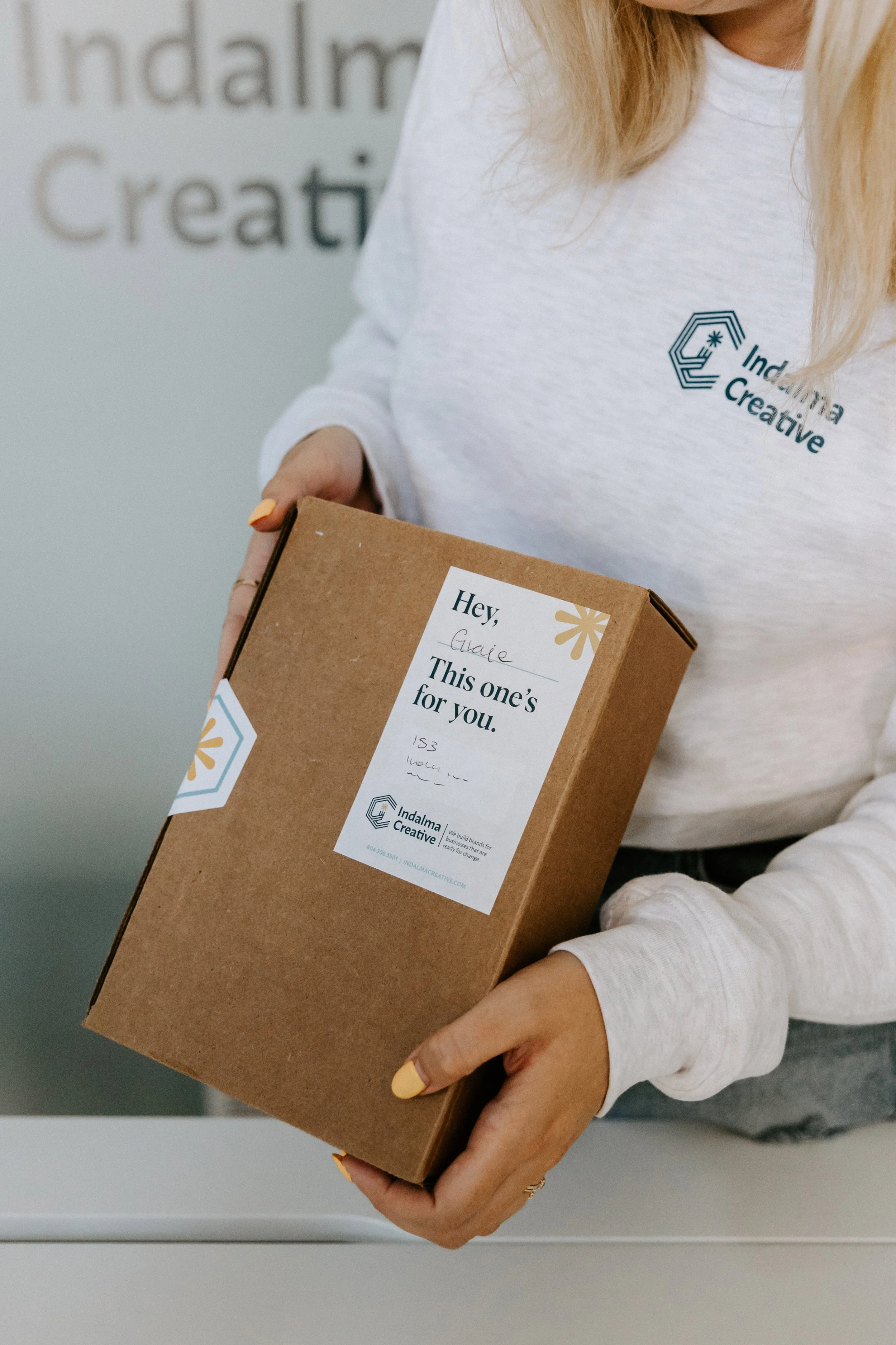
Indalma stationery is clean, minimal, and thoughtfully designed, using a light and neutral palette that aligns with our brand. Materials and finishes should feel elevated yet approachable, with a focus on consistency and quality.
Apparel
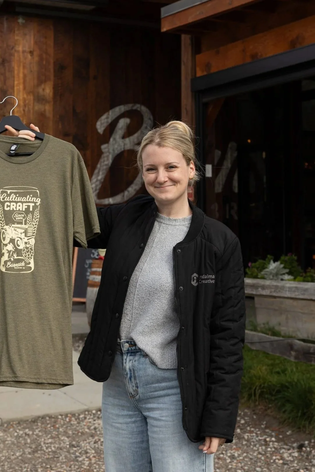
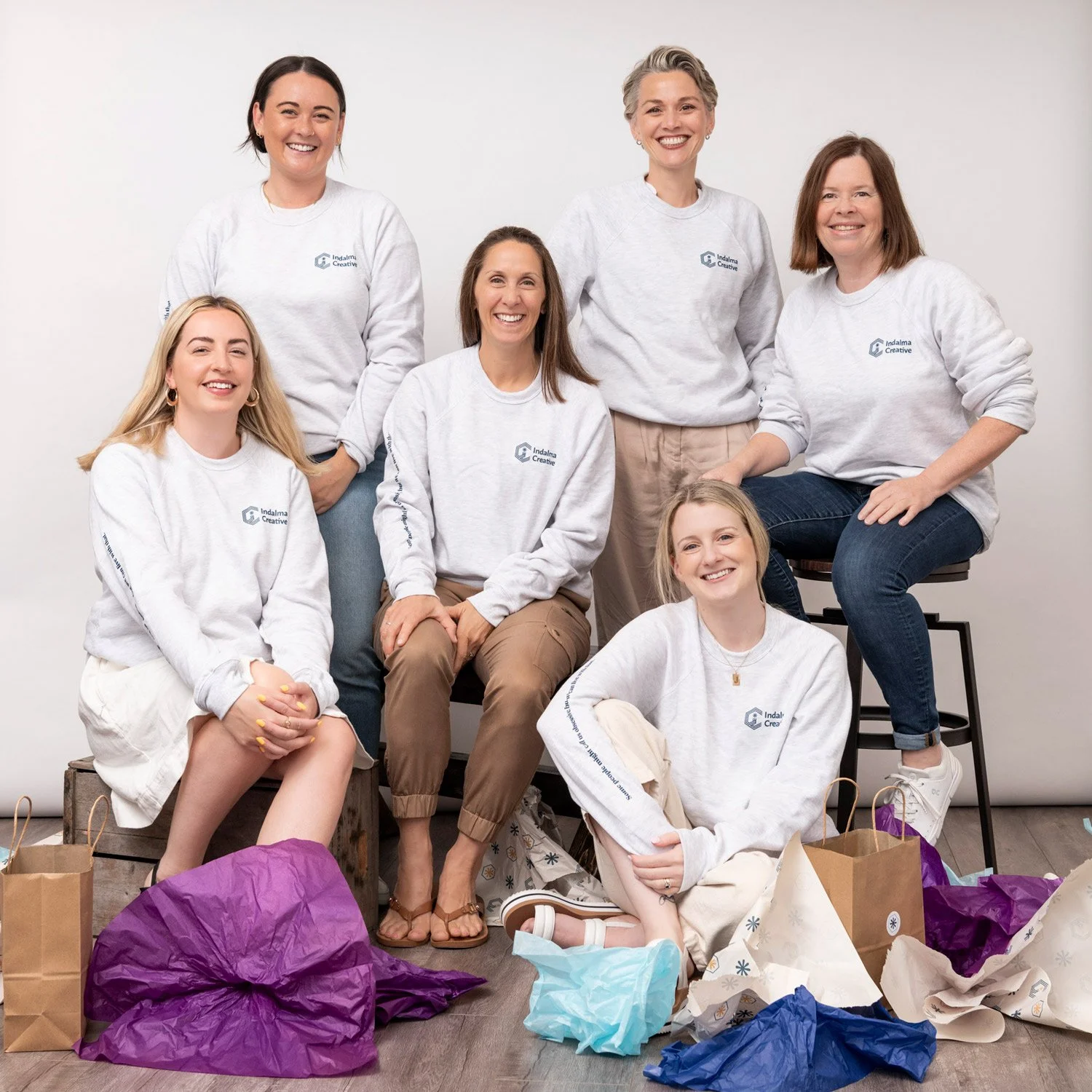
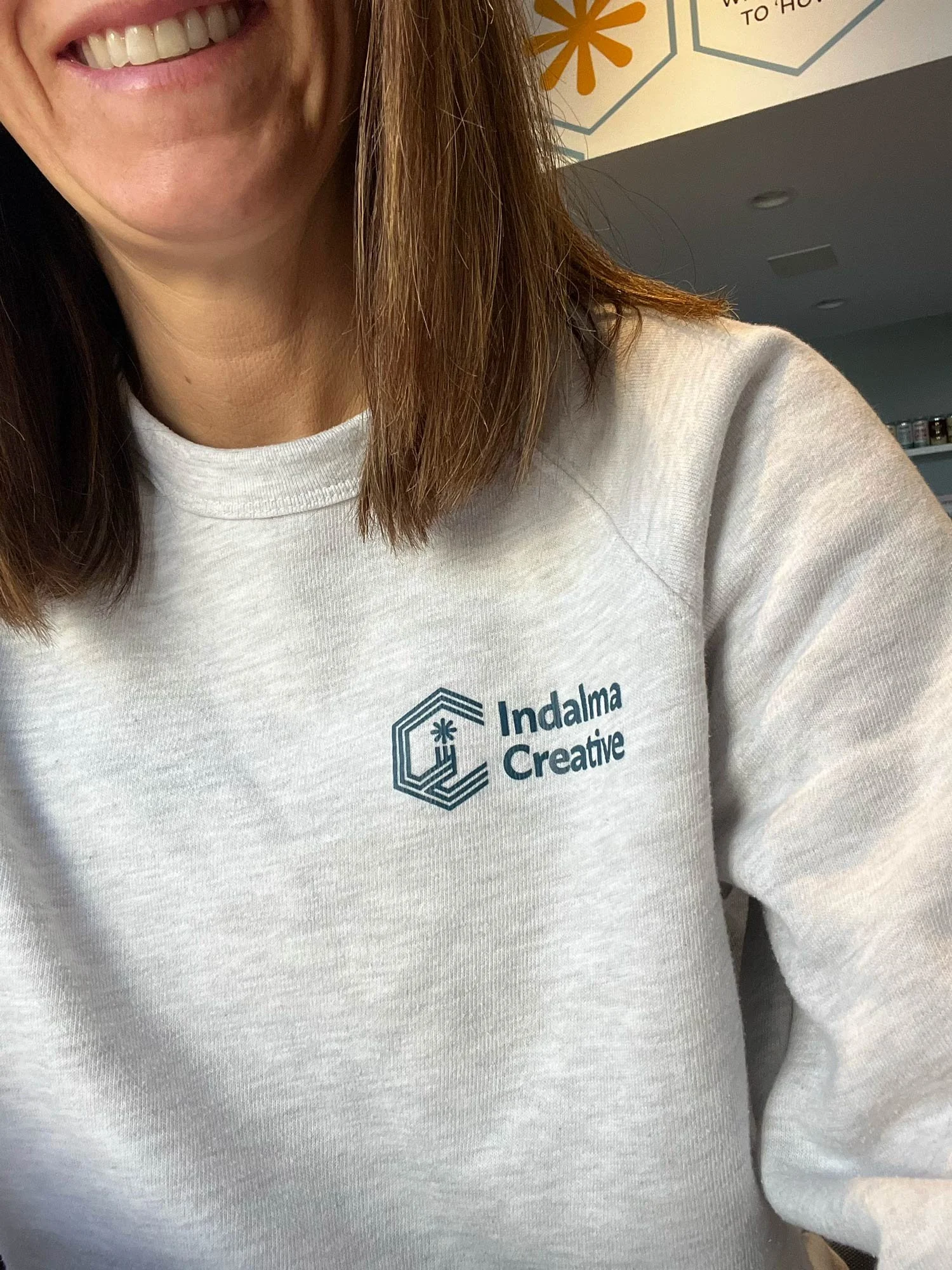
Indalma apparel should use logo and brand elements in colours that complement the garment, with combinations that feel intentional and clear. Wherever possible, stay within the Indalma colour palette. For a more subtle, elevated look, opt for single-colour applications in tones similar to the garment for a clean, modern finish.
Signage
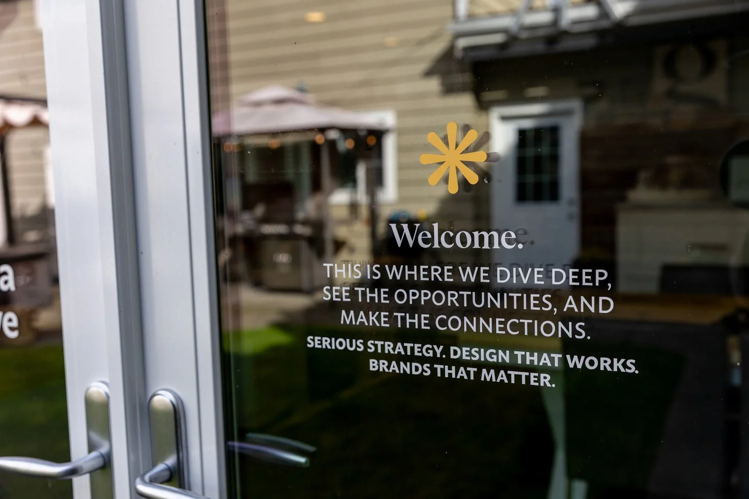
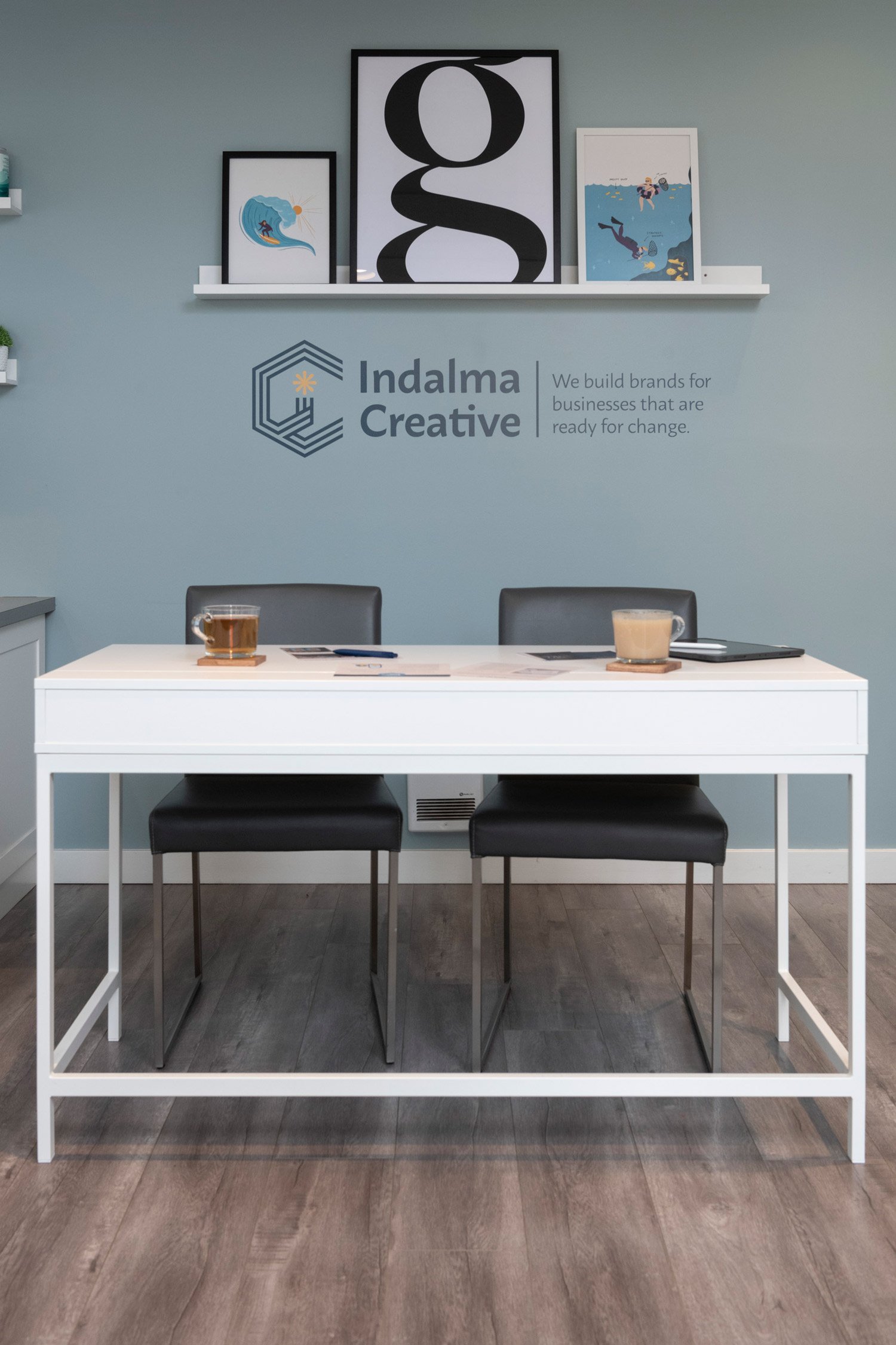
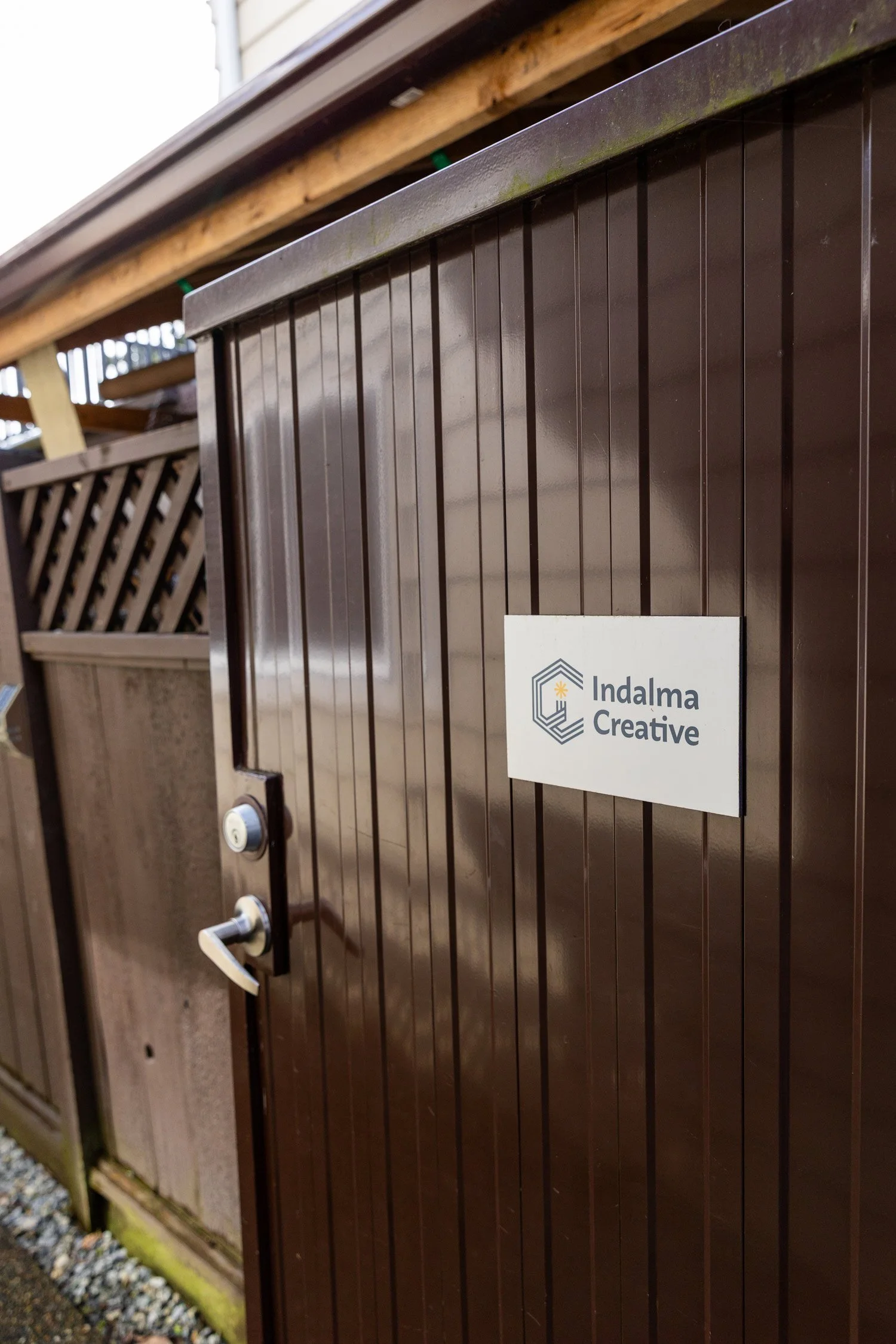
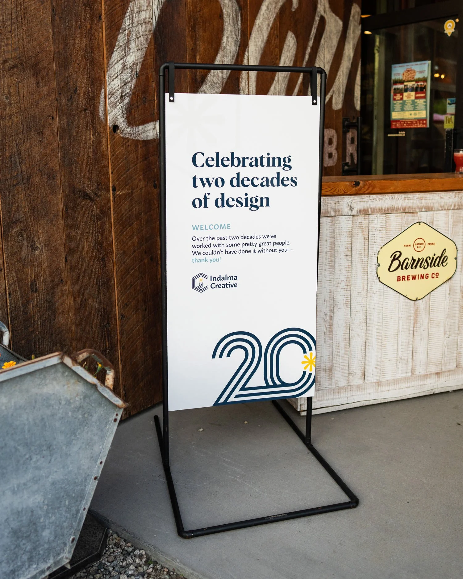
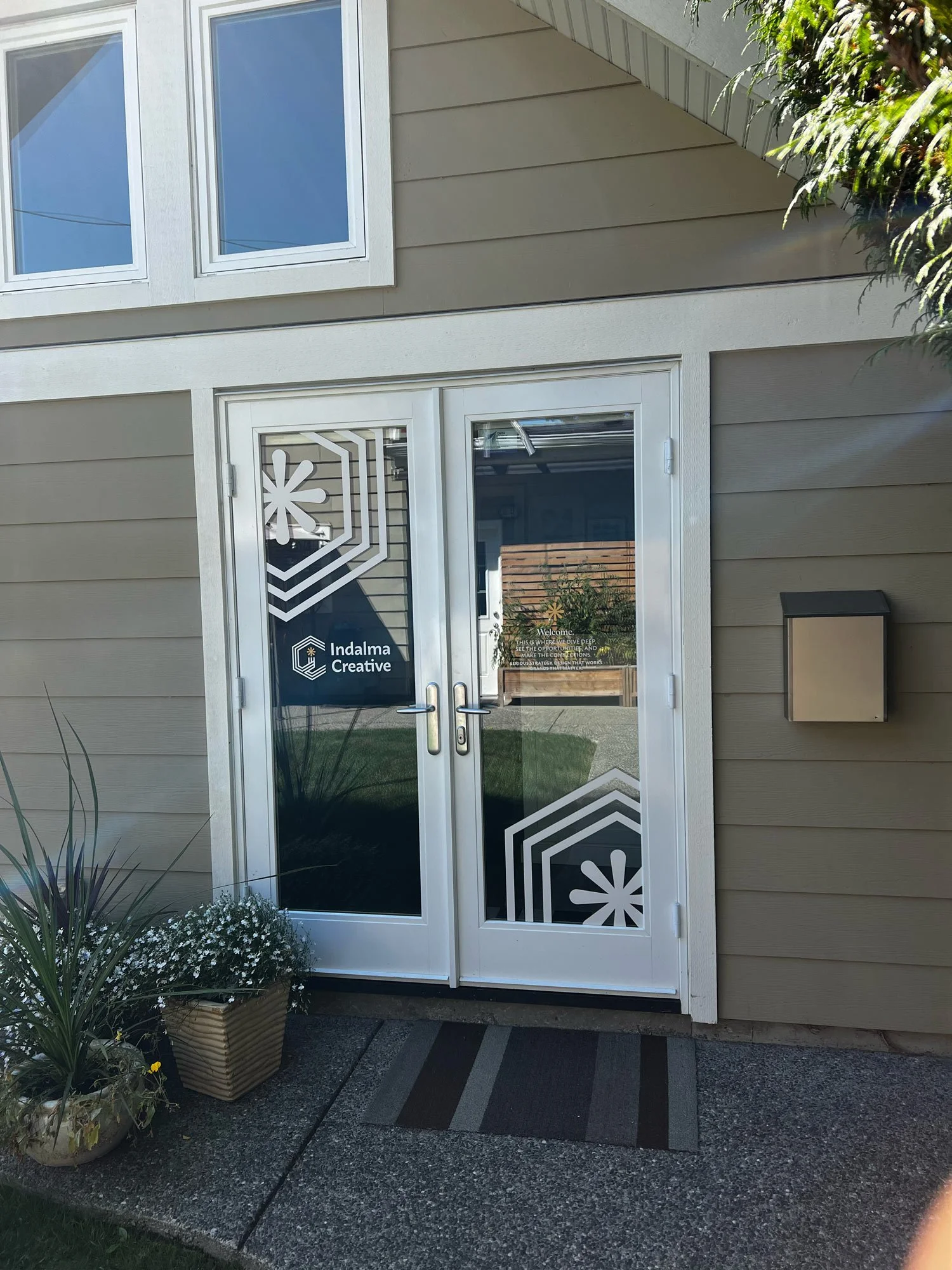
Signage brings the Indalma Creative brand into physical space with clarity and intent. Thoughtful layouts, strategic typography, and purposeful use of brand elements ensure messages are communicated clearly while creating a cohesive, recognizable presence.
Avoid overusing brand elements or cluttering the layout. The message should always lead, with design supporting and enhancing its impact.
Other brand touchpoints
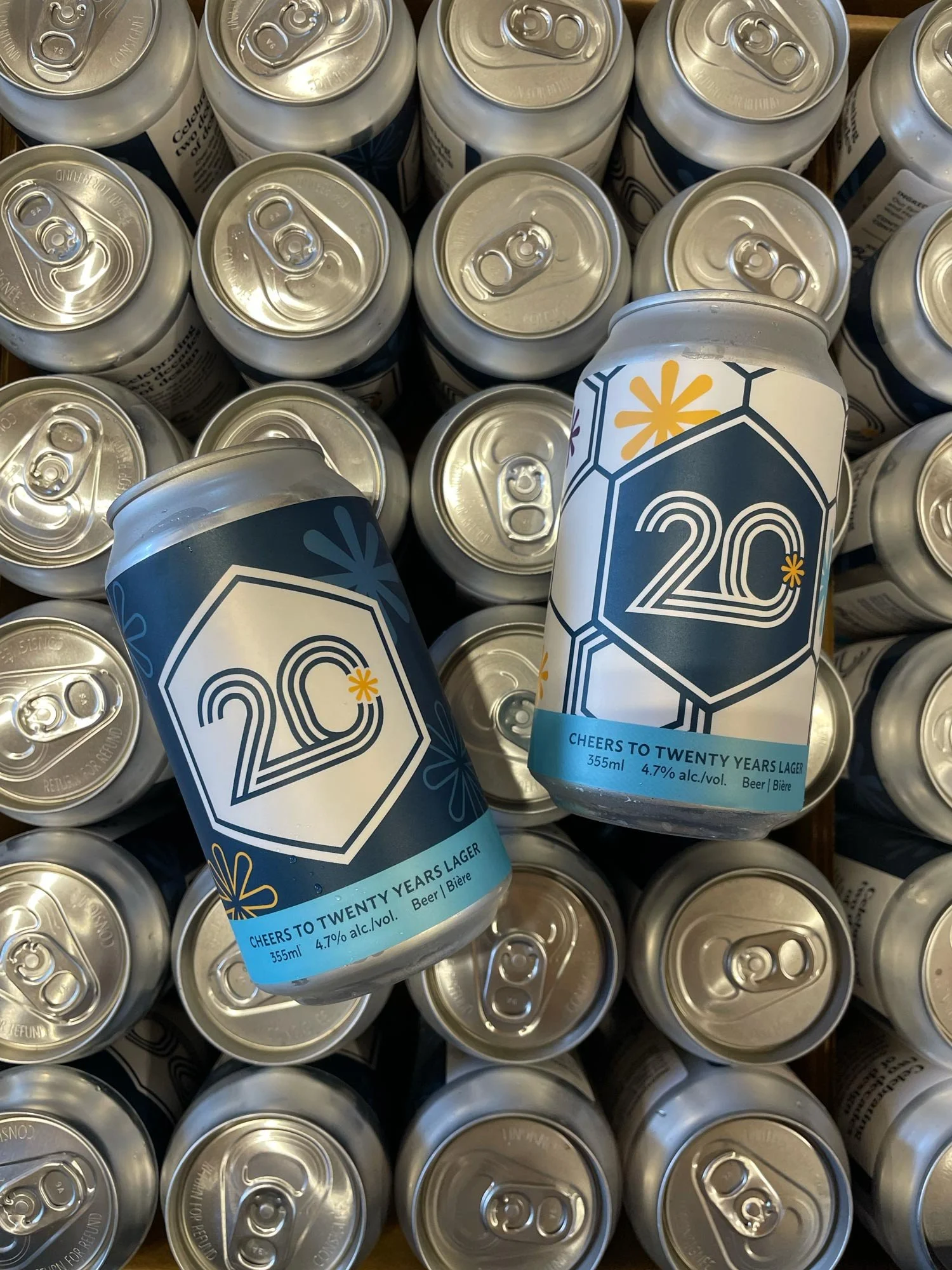
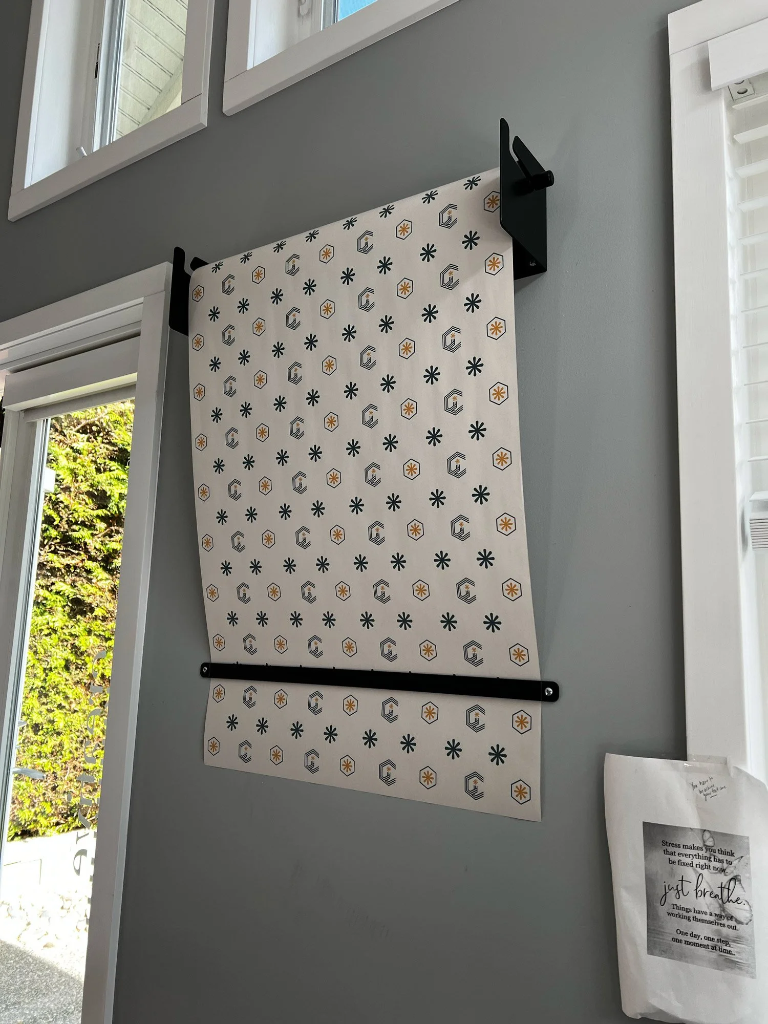
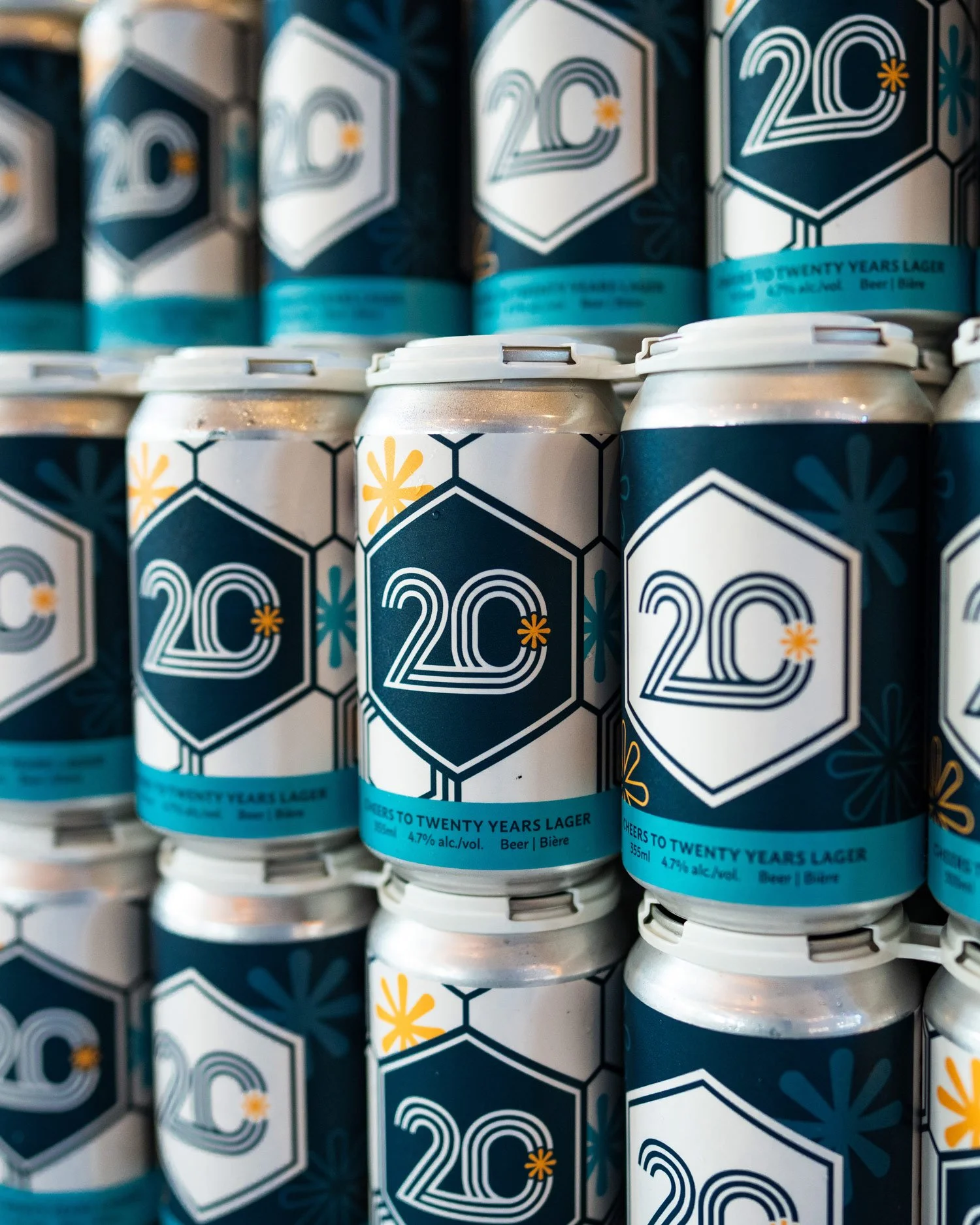
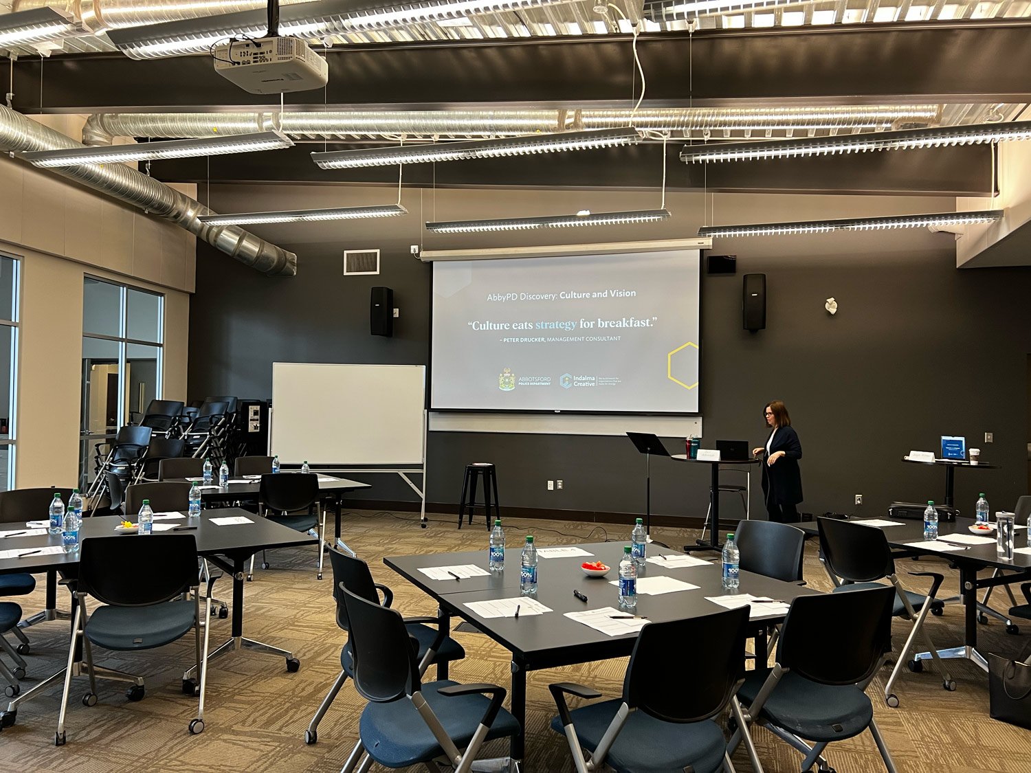
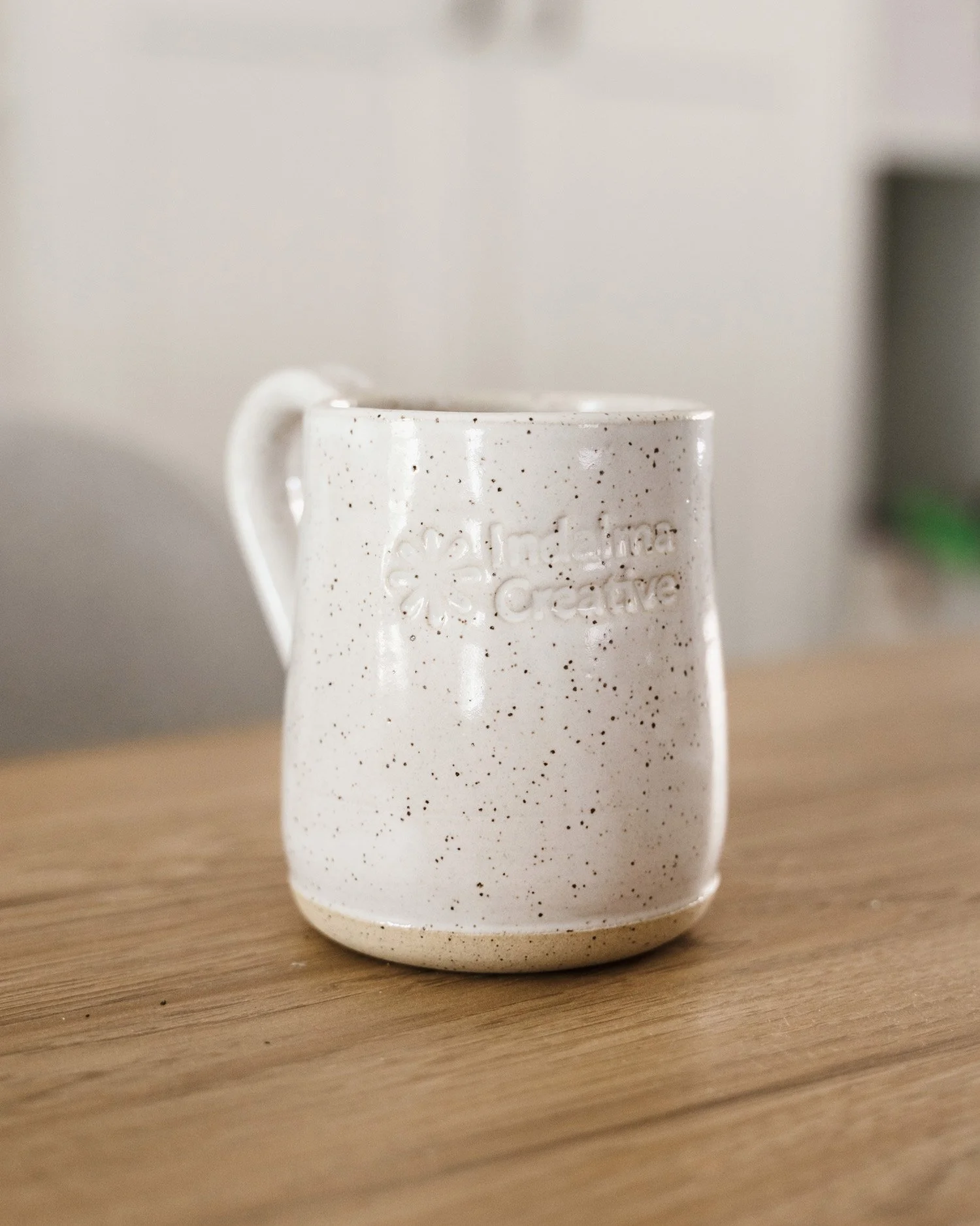
Other examples of how we’ve had fun extending the brand.
Social Media
Indalma Creative’s social media presence is designed to reflect clarity, confidence, and intention. Visually, imagery is clean, considered, and purposeful (follow our photography style guide for images).
Our social media is focused on sharing perspectives, showcasing work, and creating content that builds trust, sparks curiosity, and positions Indalma as a guiding force for brands and organizations ready for change.
Our Social Voice:
Light, informative, and friendly
Find us on social here: